#Design an App (UX)
#Overview
Thank you for your interest in building an app for the Akeneo App Store. At the moment, we are not actively accepting new submissions.
'Design is the silent ambassador of your brand'
A poor app user experience causes users frustration and can negatively impact both, your brand and Akeneo brand. Use this documentation to design usable & intuitive apps, which should ultimately help with:
- Reducing the number of customers reaching out to your support team
- Increasing the number of closed deals
- Increasing user adoption, engagement & satisfaction
To illustrate our recommendations, we created some examples through a sample app. For those mockups, we used the Akeneo Design System. If you’re interested in using the Akeneo Design System for the creation of your app, please reach out to your Akeneo point of contact.
#App users
Before creating your app, it’s critical to understand:
- Who the users are
- What they are trying to achieve in your app
To do so, use the following template and keep it handy throughout the app creation process.
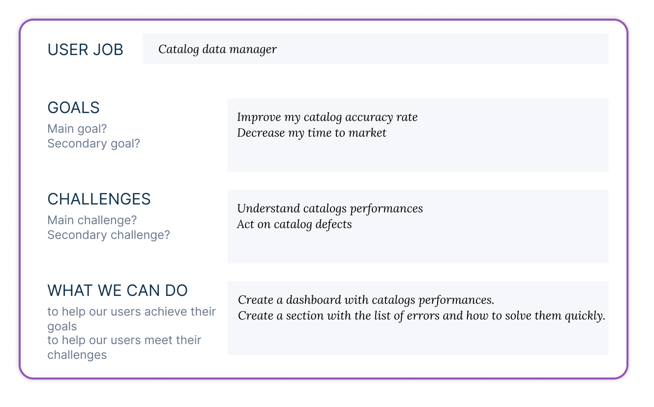
Refer to this template continuously during your project
We recommend you refer to this document during the app conception, to make sure the user remains at the center of your work. For instance, it will help ensuring the features respond to the user goals, ensuring the wording used is clear for your typology of users, defining the kind of helper your users need, etc.
#Onboarding
The onboarding flow depends on the complexity of the app. The main point to keep in mind is to guide the user from the beginning to the end of the first set-up.
First time experience is key: If people can’t use the app properly they might quit and never come back.
When designing the experience, put yourself in the shoes of a first time user and ask yourself:
- Is the language clear? Sometimes we tend to use our company internal language or use technical terms that our users aren't familiar with.
- Is it easy for the user to understand the first actions they have to do? A common pitfall is to show a first time user an empty page with no call to actions.
Here are a couple of different ways to onboard a user:
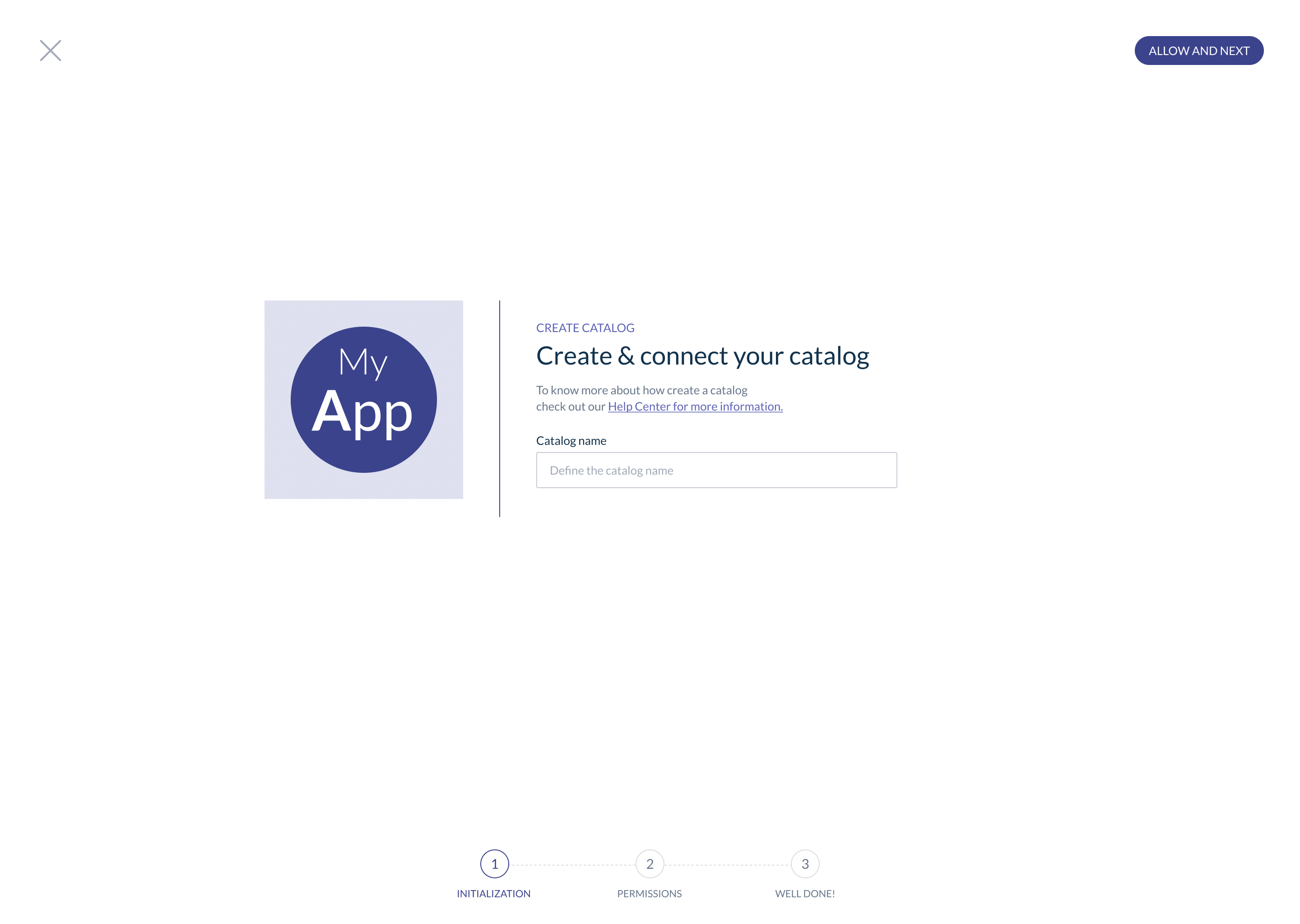
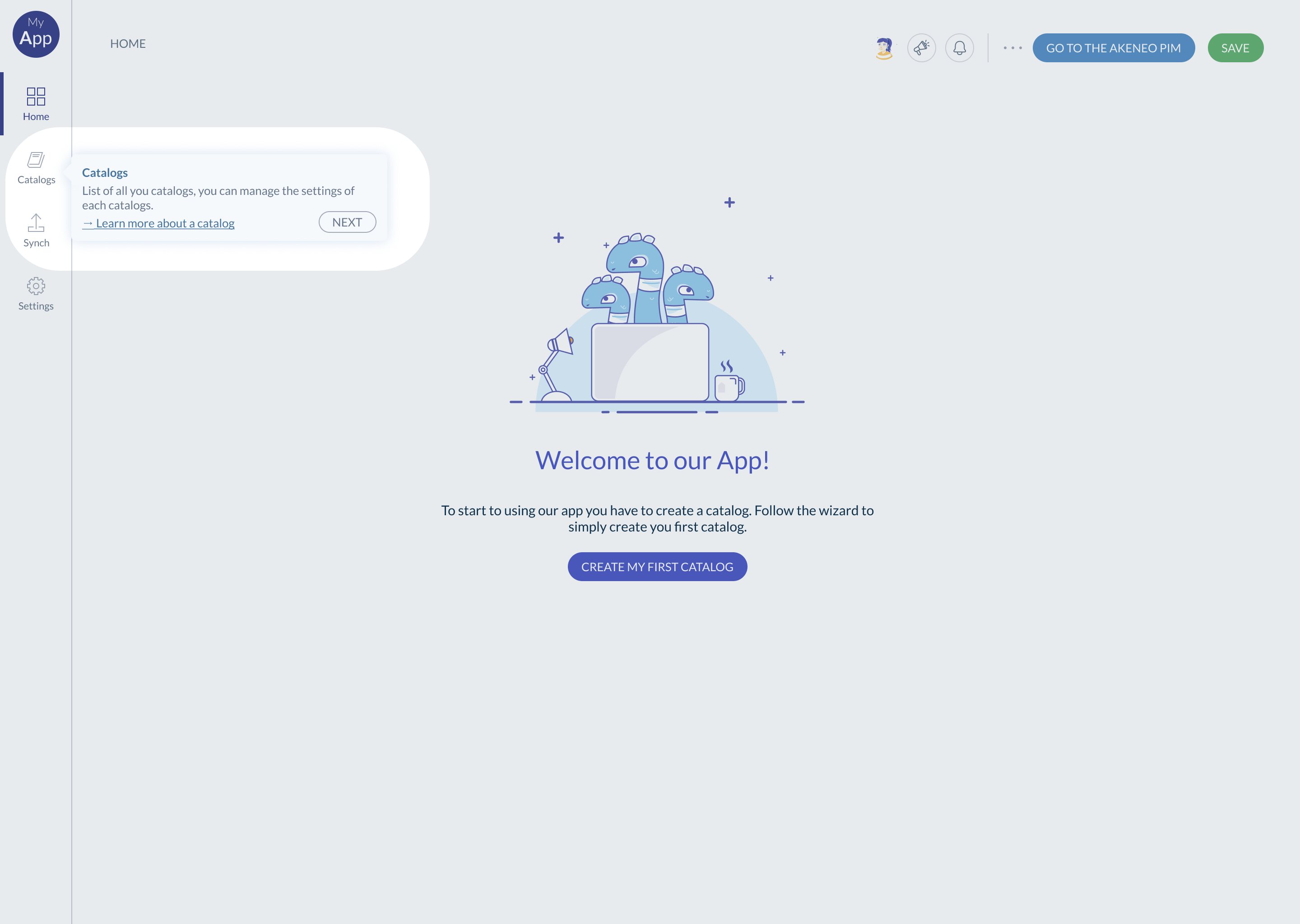
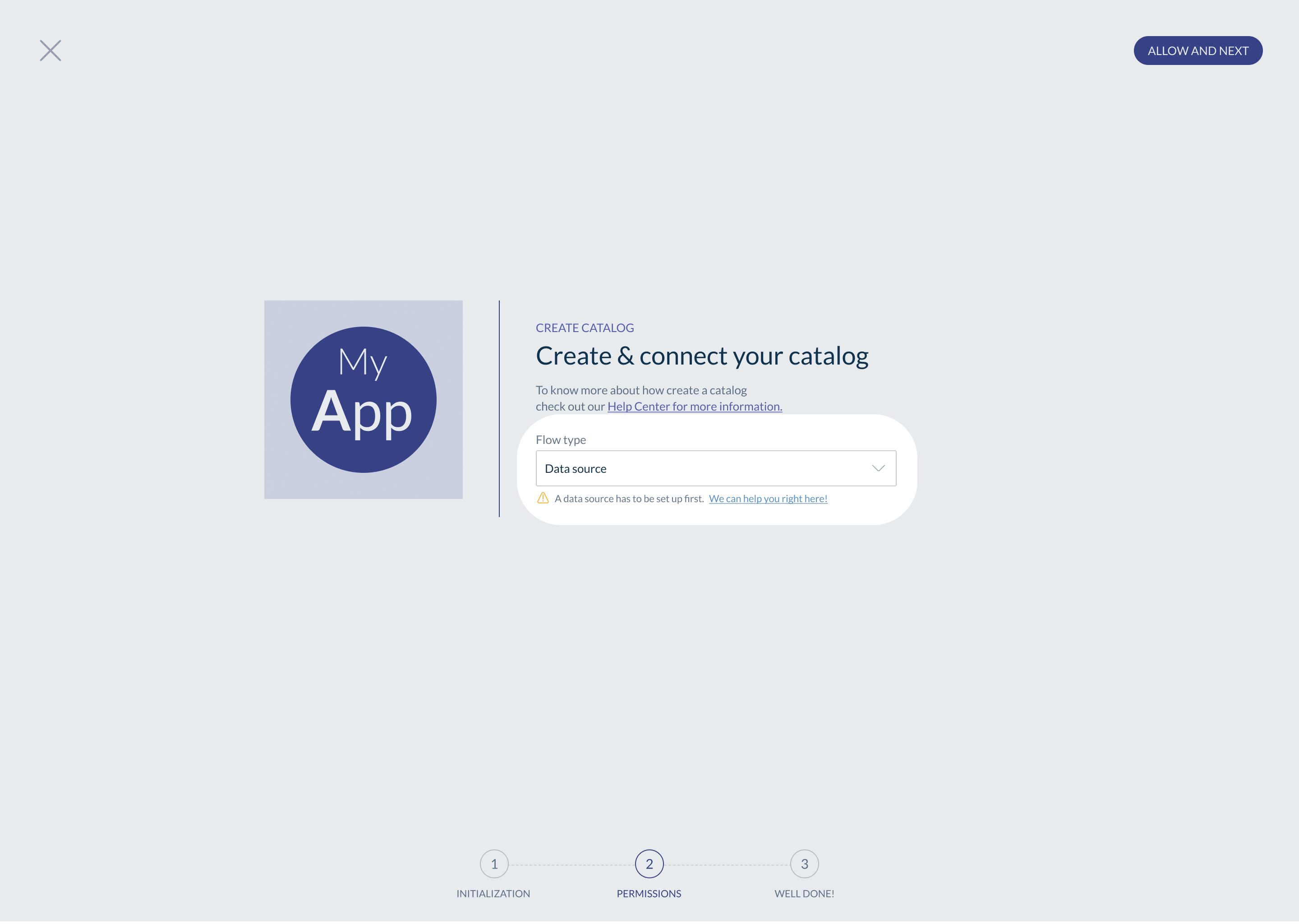
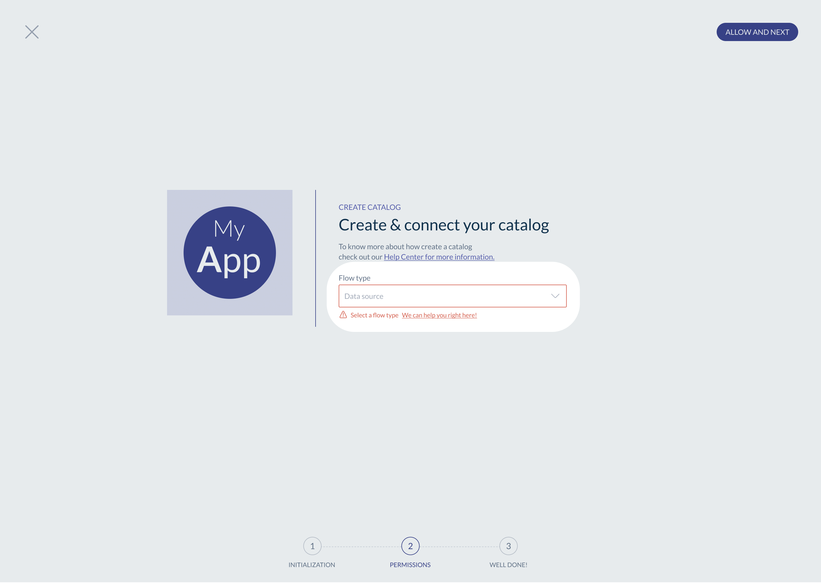
#The Wizard flow
This one is the most simple to implement, and it's also the most guided for the user.
We recommend this one when the set-up is complex - eg. several configuration steps or a technical set-up.
The wizard can be a pop-in or a series of screens. It provides a step-by-step guide to all the actions.
Each step has a main action and a description of the step. The user goes through each step, one after the other. Always display the total number of steps to achieve and a success message at the end of the flow.
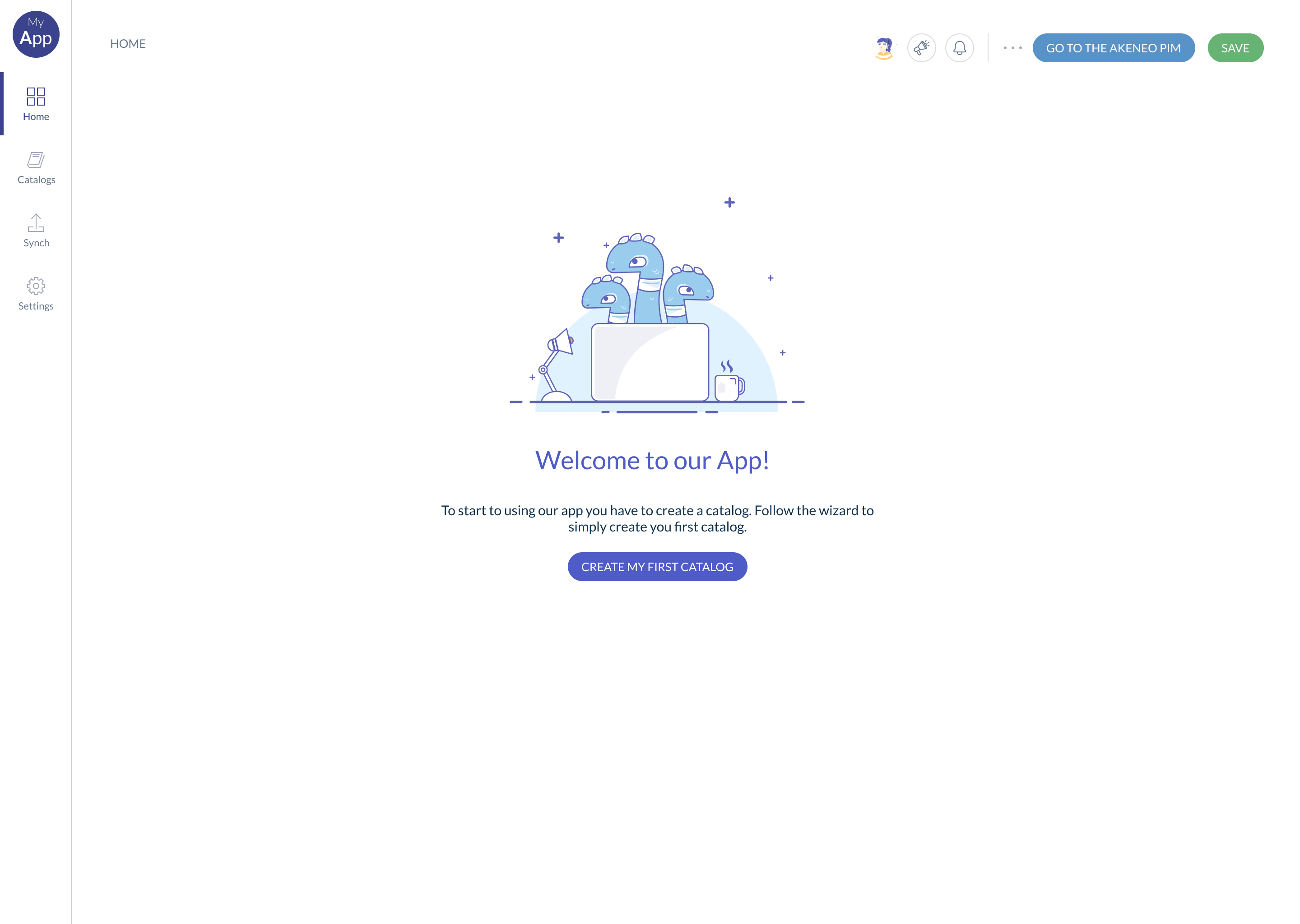
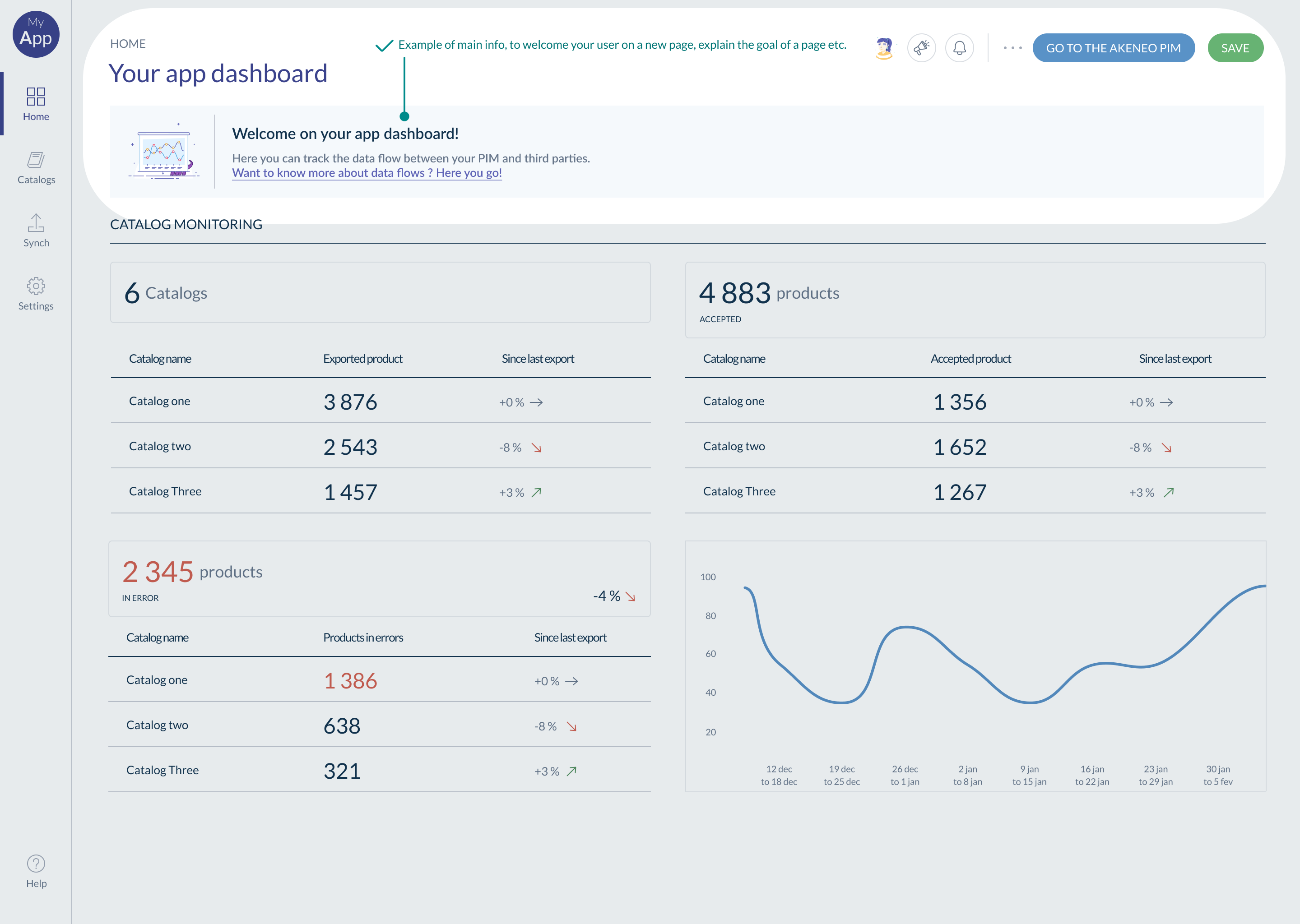
#Homepage - First visit
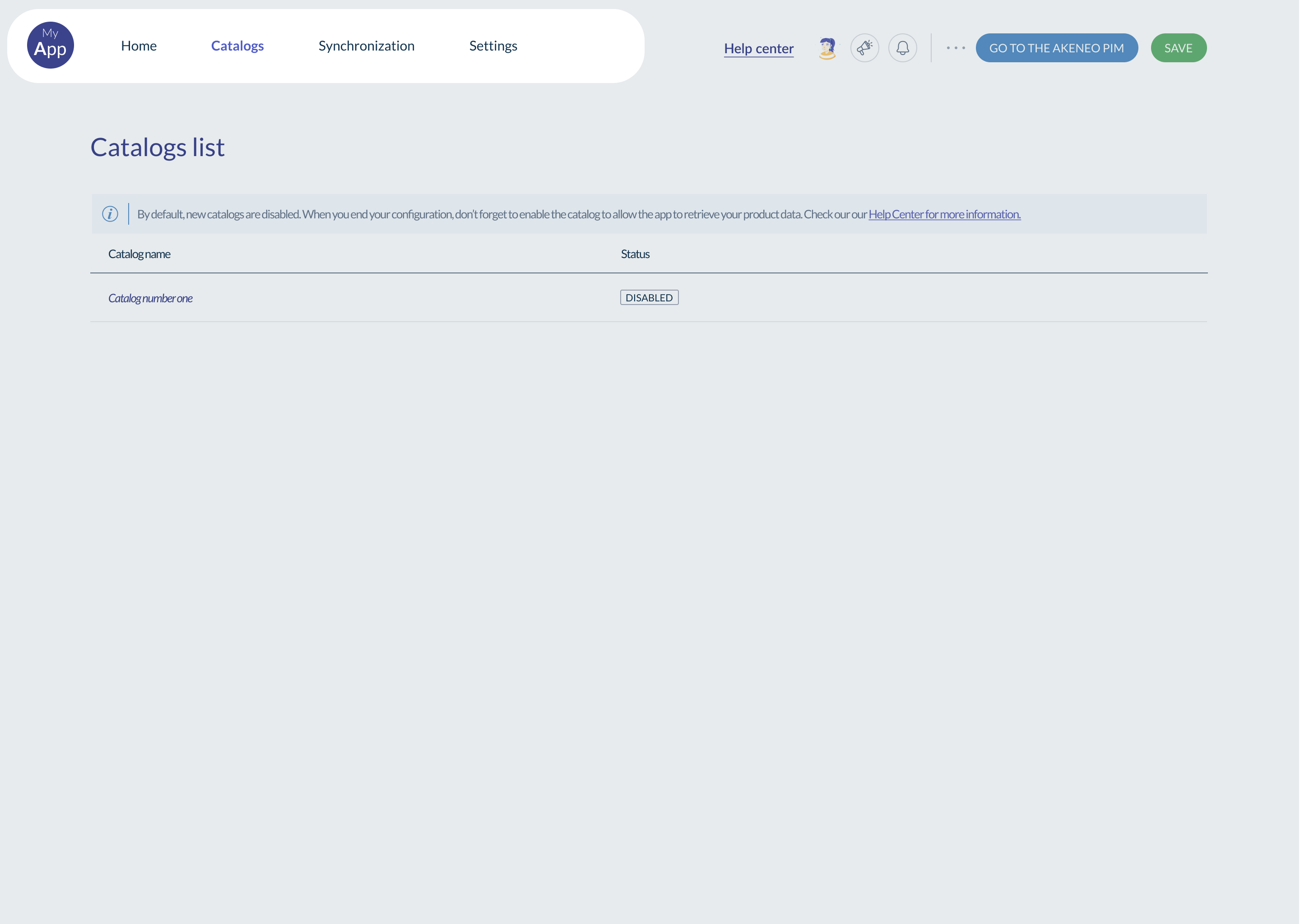
When using your app for the first time, users should be able to understand easily what to do. We recommend a page showing only the most important information & actions for the user:
- A welcome message with information about the first steps to accomplish to start using your app.
- The main call-to-action, this button has to be engaging and clear, with an action verb.
🟢 Good example of a homepage page for a first visit 👇
🔴 Bad example of a homepage page for a first visit 👇
Also see: Homepage - daily use here
#The guided tour
When no user set-up is required during the first use, consider creating a guided tour, such as:
- A short video explaining your app's main features and usage.
- Or a dynamic highlight of key areas with a short explanation for each.
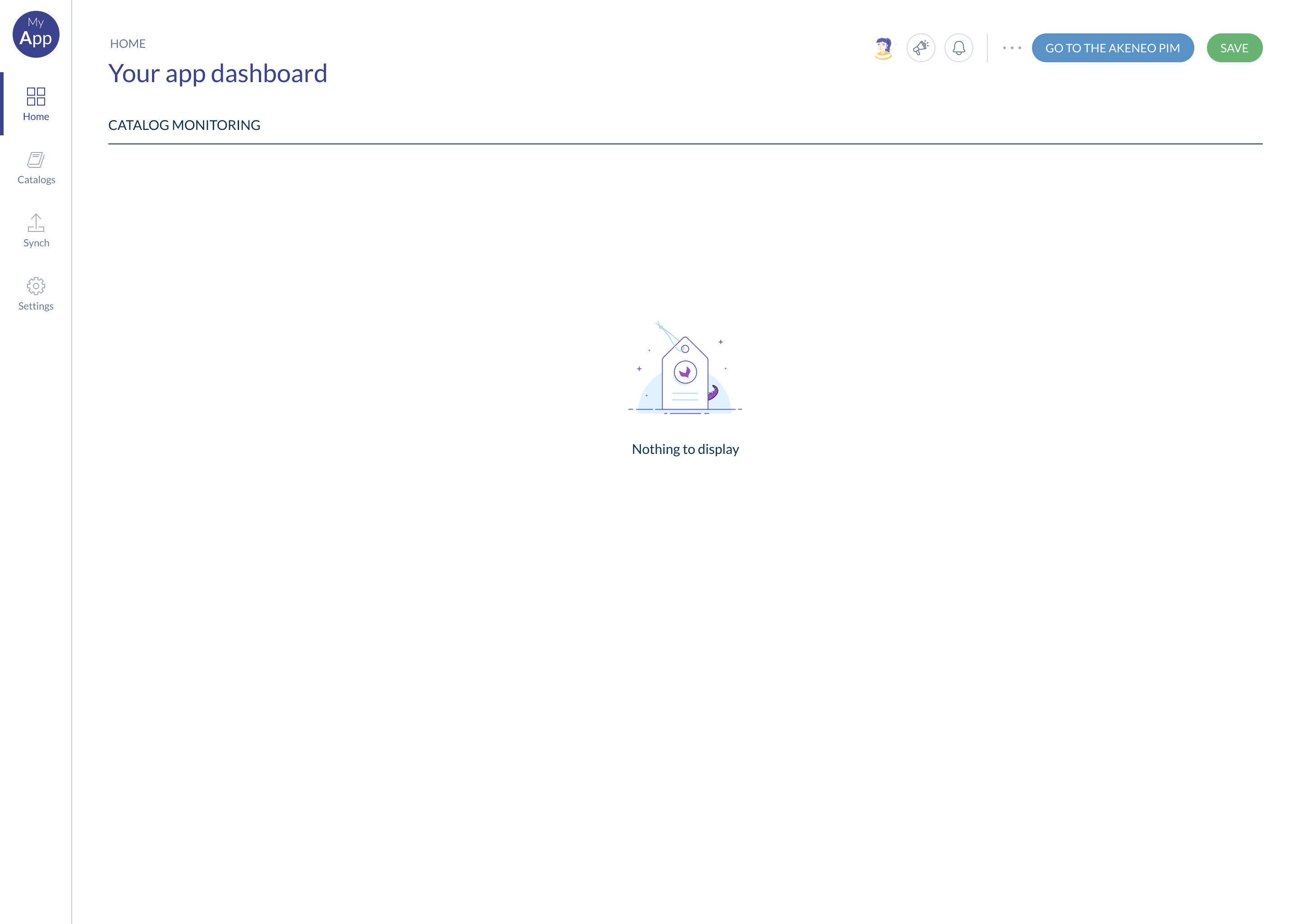
#Homepage
First time user vs returning user
Your homepage should probably look different for a first time user vs a returning user. In the previous section, we focussed on the first time experience. In this section we will have a look at the daily use (ie returning users).
#Daily use
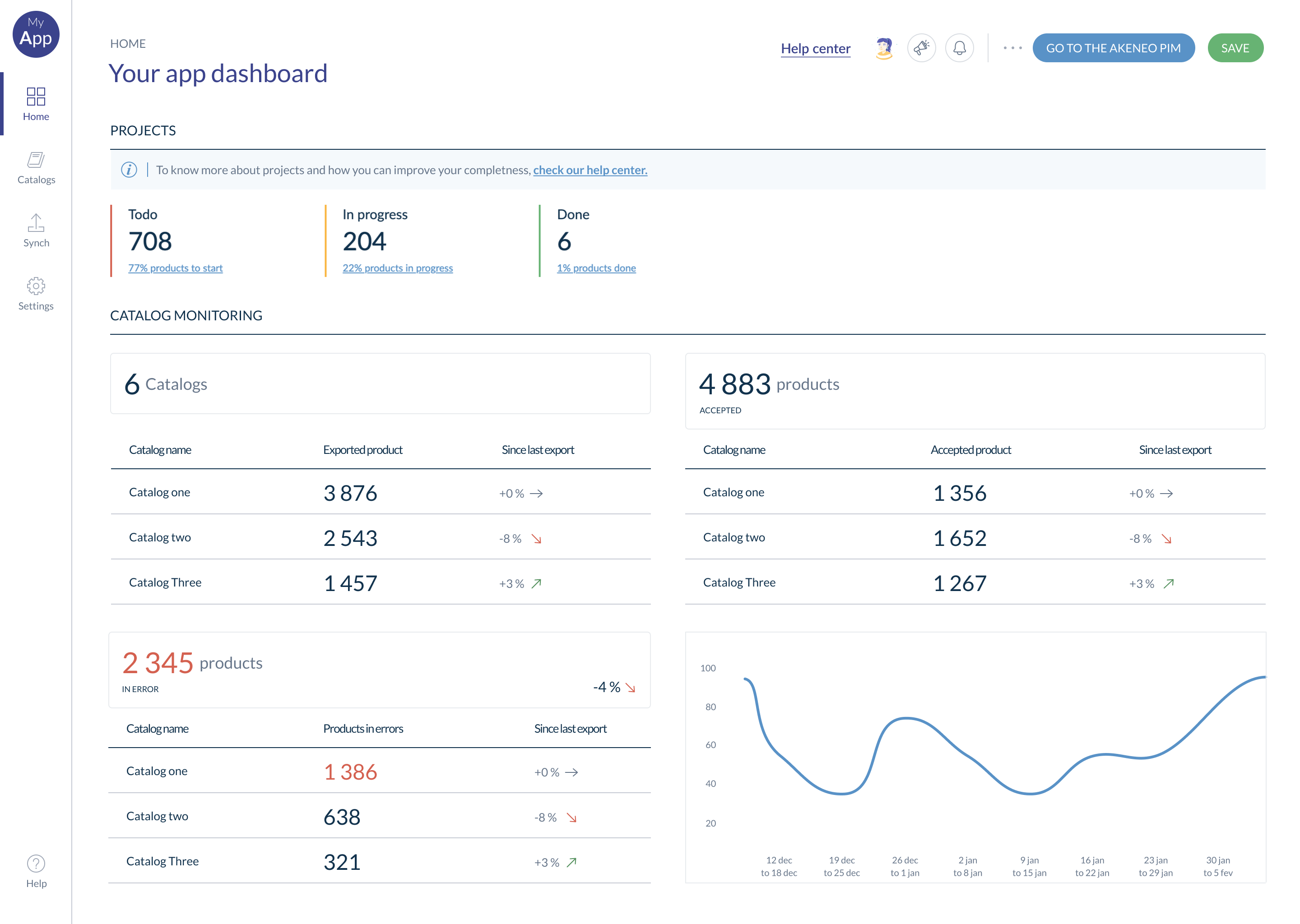
The homepage content depends on the user goals. When a user opens the app, they have to find the first information and actions needed to accomplish their tasks/goals.
Consider showing the following:
- The key information that will drive the user tasks (eg. a dashboard)
- The main call to actions
- A way to access the support documentation and to contact the support team
We recommend designing the homepage last. By doing so, it will be easier to identify and leverage the most relevant features and information the user would need to see on the homepage.
#Guidance & support
Ensure you are here for the users when they need you
Sometimes the information displayed in the app is clear for us, but not for the users. Other times, users get stuck, which can be very frustrating for them. This section is about providing contextual guidance and access to support, so our users can easily find answers to their questions, and get back on track.
Beyond impacting the user, providing guidance and support helps reducing the number of tickets to your support team.
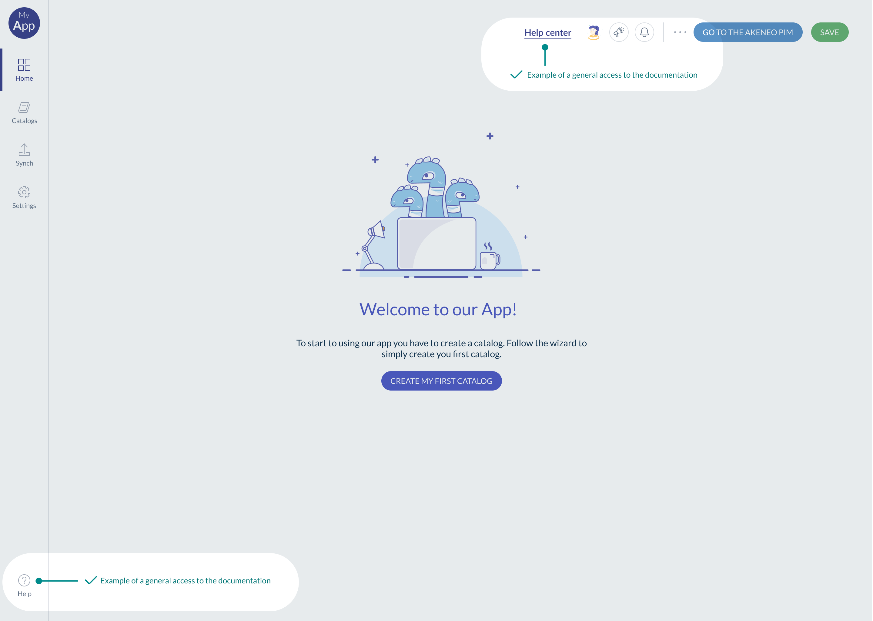
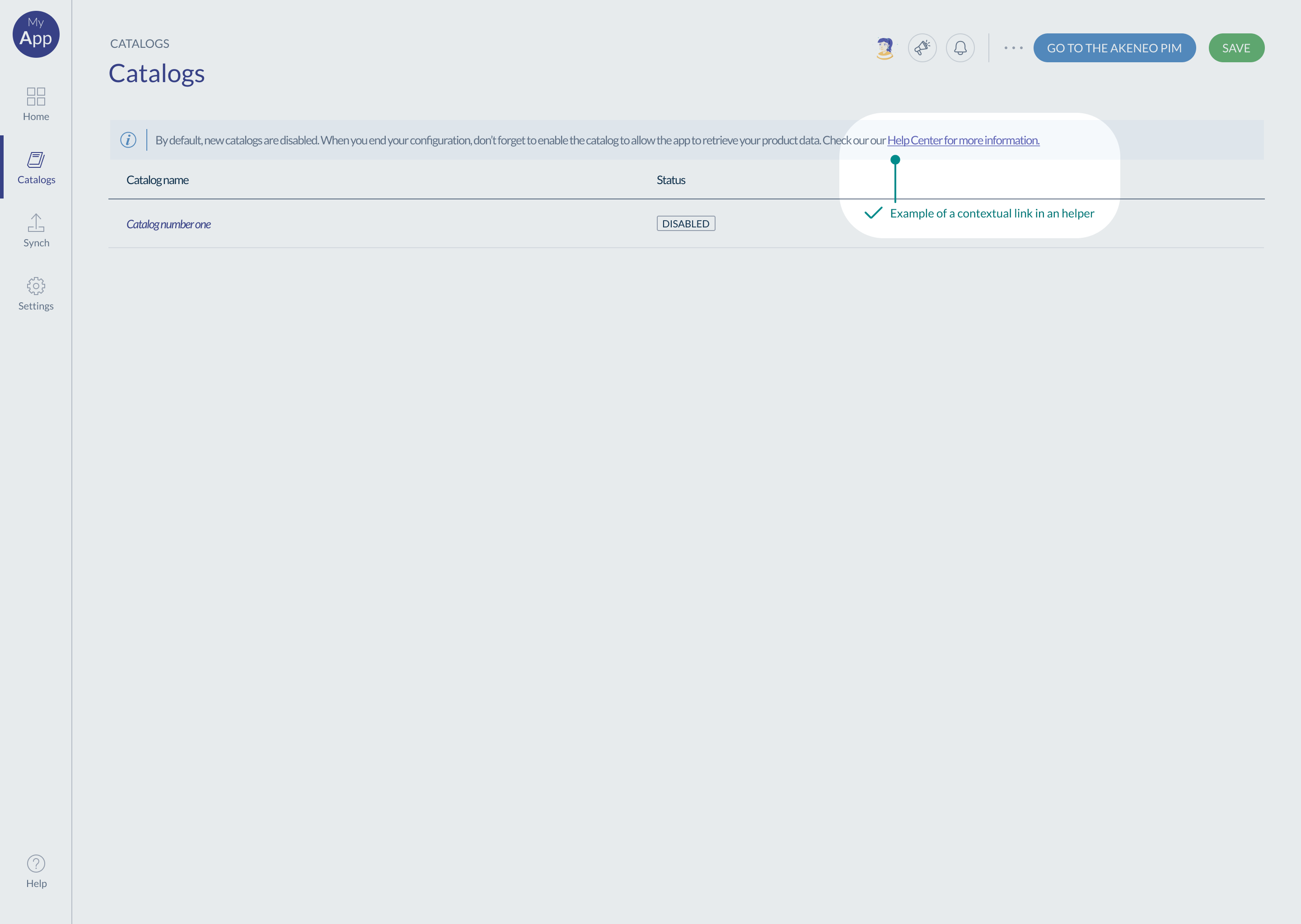
In your app, users should be able to find access to your support documentation easily.
Consider the following examples:
- A general link in the main navigation
- In 'helpers' (ie. banners) via contextual access to the relevant part of your documentation.
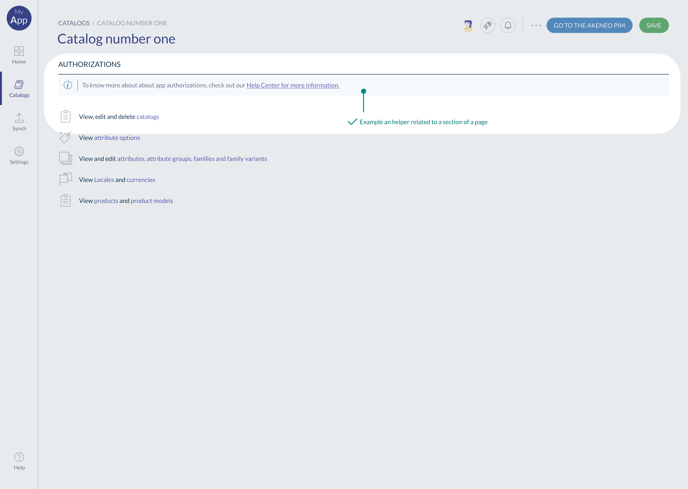
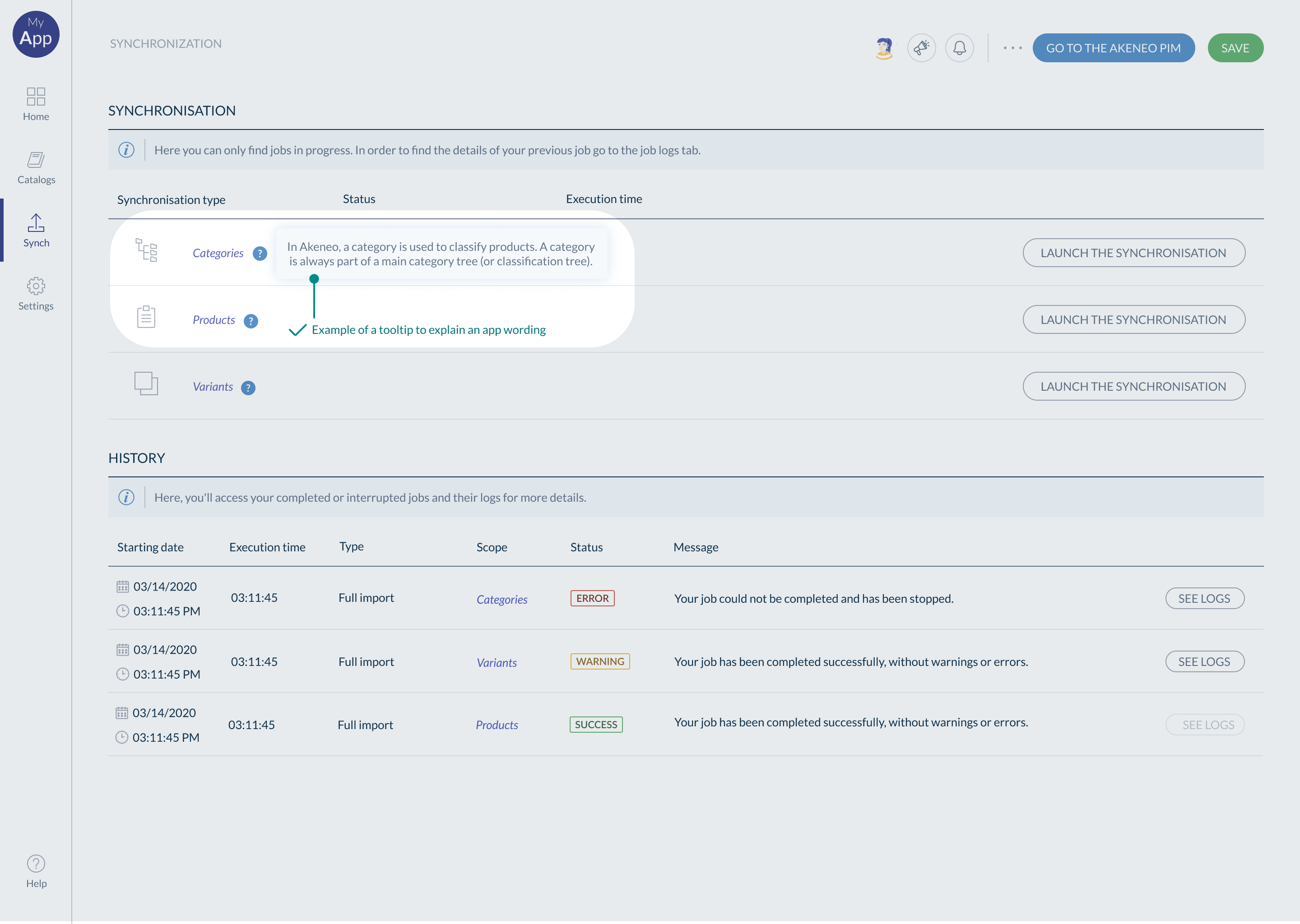
#When to use a 'helper' and how to decide which 'helper'?
There 3 types of helpers you can use: information, helpers and inline helpers. Depending on where you are on the page, you’ll use one or the other.
- General helper (called 'Information' in the Akeneo Design System): used at the page level
- Section helpers (called 'Helpers' in the Akeneo Design System): used at the section level
- Inline helpers (similar name in the Akeneo Design System): used at the component level
General helper: This helper describes the goal of the whole page and often links to documentation.
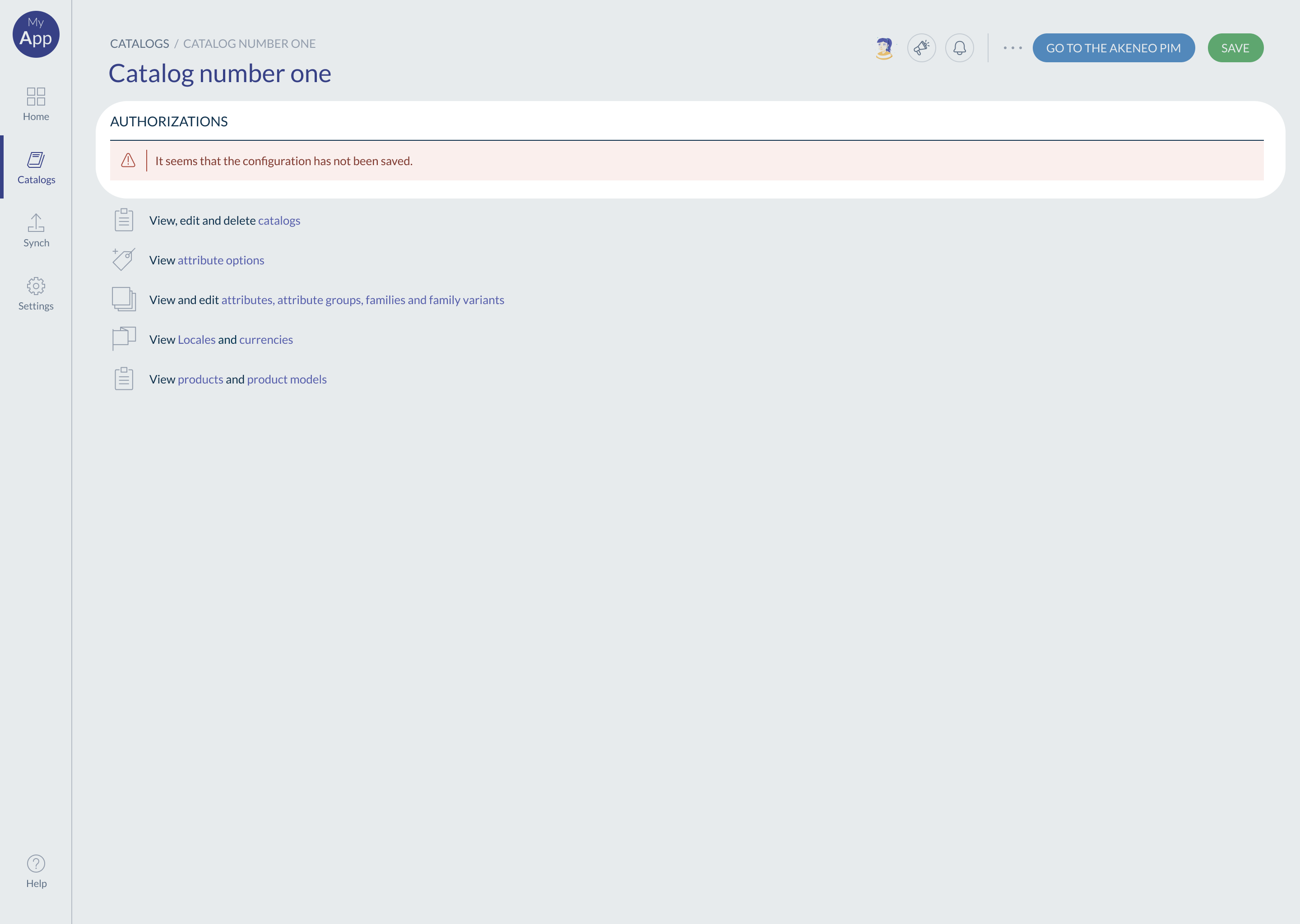
Section helper: This helper is linked to a section (group of information and actions) and describes an expected action or a feature.
Section helpers can also have 2 other states:
- Warning: to warn the user about a feature limitation or any other important message.
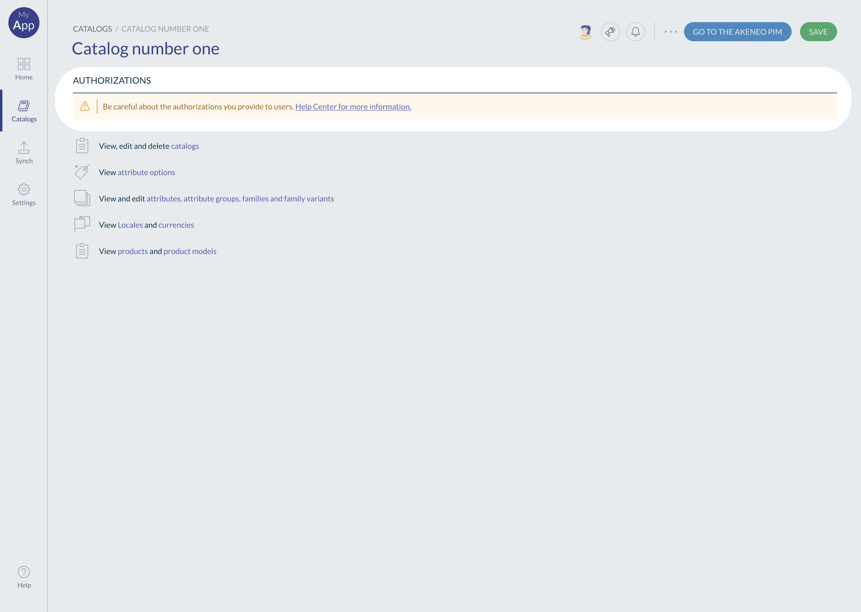
- Error: to explain a critical error.
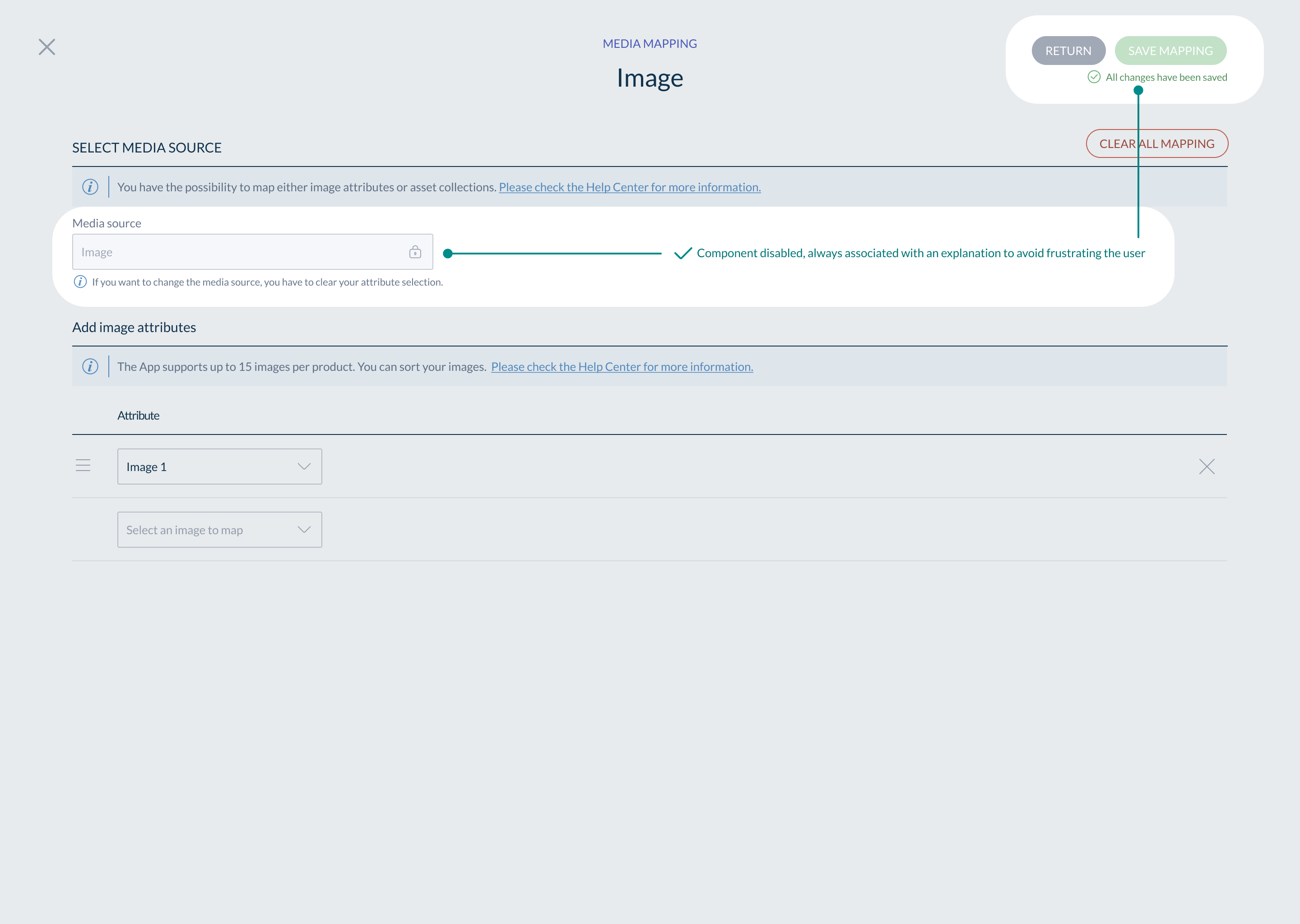
Inline helper: They are linked to another component, such as a button or a field. They explain the behavior/state of this component.

Inline helpers can have also 2 other states:
- Warning: to warn the user about a feature limitation or any other important message.
- Error: to describe an error in the component.
Tooltip: Use to explain the wording of your app or a component state.
Message bar: to provide user feedback. Users need to know how a task performed (success/error/failed)

If you believe users may have a question, add a helper.
#Navigation
Organize & arrange information to make it easier for users to find what they are looking for, and understand where they are.
Navigation is not only a way to access a page, it’s also here to support the user flow; the hierarchy of pages. Take time to think through the navigation structure as it is foundational to the user experience.
Before you start:
- Understand your user's goals and features. Define your app users.
- Be aware of all the content available in the app
#Main guidelines
- A page must contain features/information that work together for a specific goal, which should make sense for the user. They have to accomplish a dedicated task in the same area.
- The page organization should follow the user's flow.
- Pages that users use the most must be more visible than others.
- A breadcrumb is essential to help the user to navigate and always know where they are
- Use short and simple language
#Recommended types of navigation:
The first one is the top navigation; this is ideal if you don't have a lot of entry points. It saves space on the page. Items are organized horizontally. Consider using it with a 'sticky' mode, to keep the navigation visible at all times.
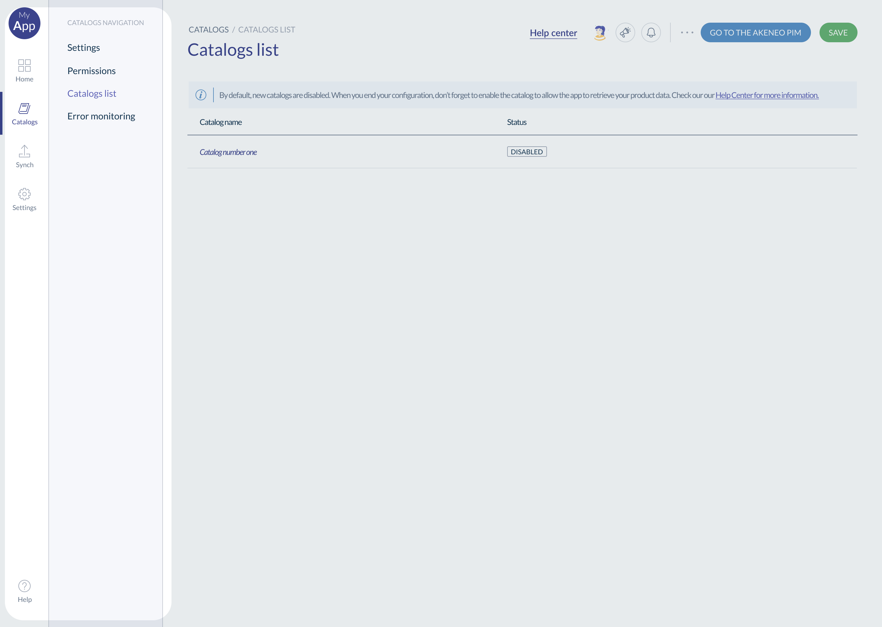
The second one is lateral navigation; this is ideal if you have many entry points and different levels of navigation. It allows to present all the pages and the sub-pages. We recommend not allowing scrolling in the navigation to avoid hiding information from the user.
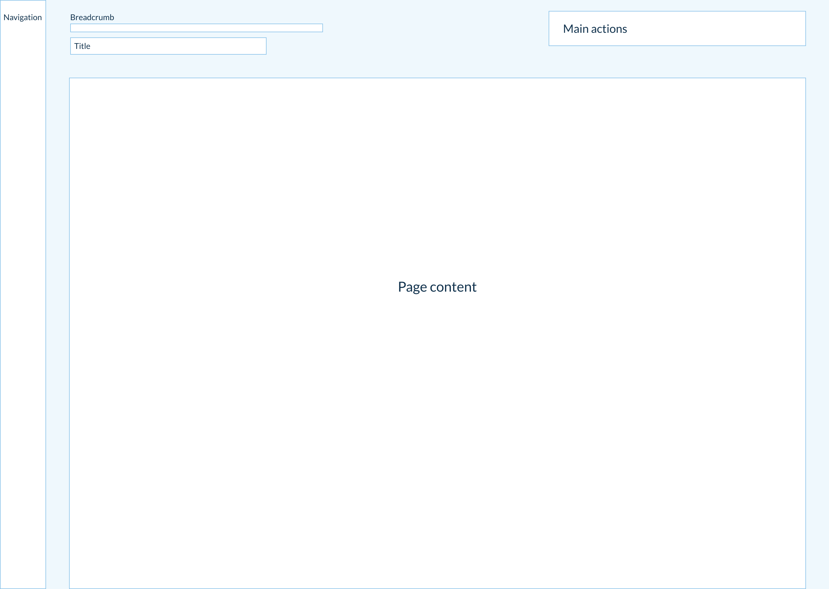
#Layout
The layout is the structure used to organize content.
When designing your app, think about patterns that will improve the user experience, but also speed up the development process. A pattern is a common structure between app pages that participates in design homogeneity.
Layouts contribute to less cognitive load, better user efficiency, and ultimately better app adoption.
#What do we mean by Layout?
Layouts are used on every pages. They define how pages, pop-ins, buttons and components are organized, making their positioning on the page easier for the designer.
Note: if you browse Akeneo PIM pages and features, you will see a similar structure for all pages.
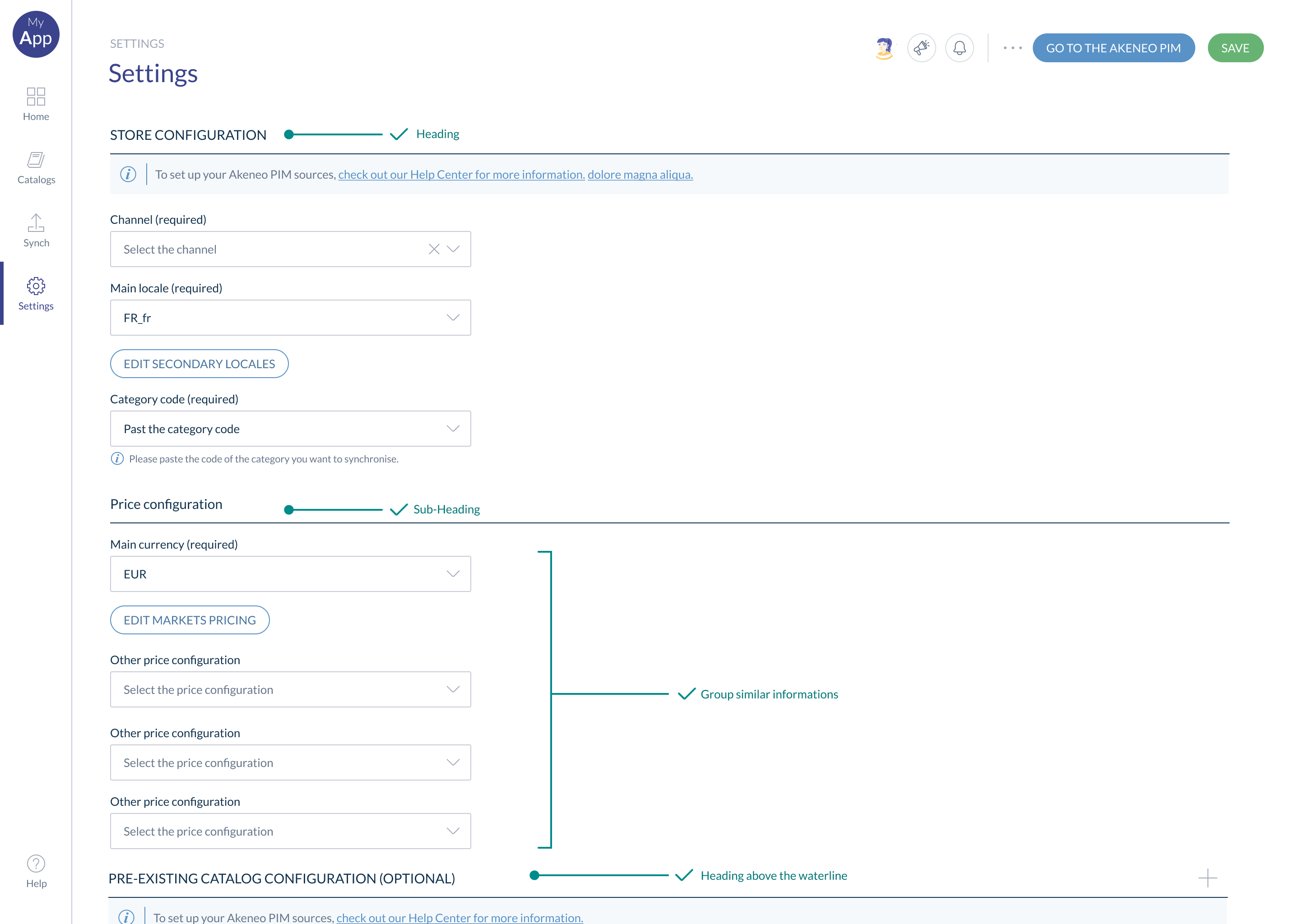
#Content hierarchy
Objects that are close to one another, tend to be grouped together.
Proximity helps establish a relationship with nearby objects. User understand they share similar purpose or traits. It helps users process and organize information faster and more efficiently.
The content hierarchy contributes to a good user experience. This hierarchy should reflect your app expertise and the user goals.
To organize information logically, you can use:
- Headings
- Sub-headings
- Group similar information or features thanks to sections or tabs.
Organize the information in a consistent manner, as it helps the user achieving their goals.
Make key features & actions visible
The user should be able to identify easily all the features & actions within a page. A hidden feature located too low on the page can be a real pain point for the user. To avoid that, we recommend using tabs, for example.
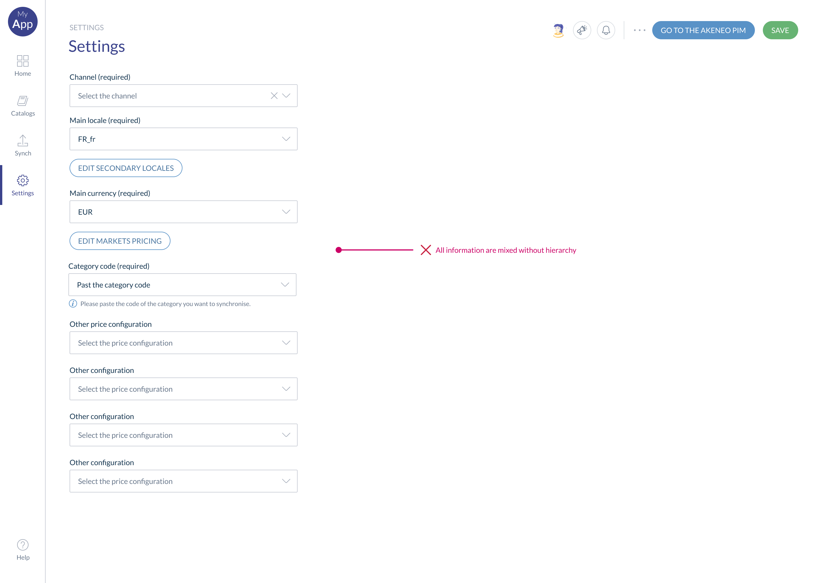
🟢 Good example of information hierarchy 👇
🔴 Bad example of information hierarchy 👇
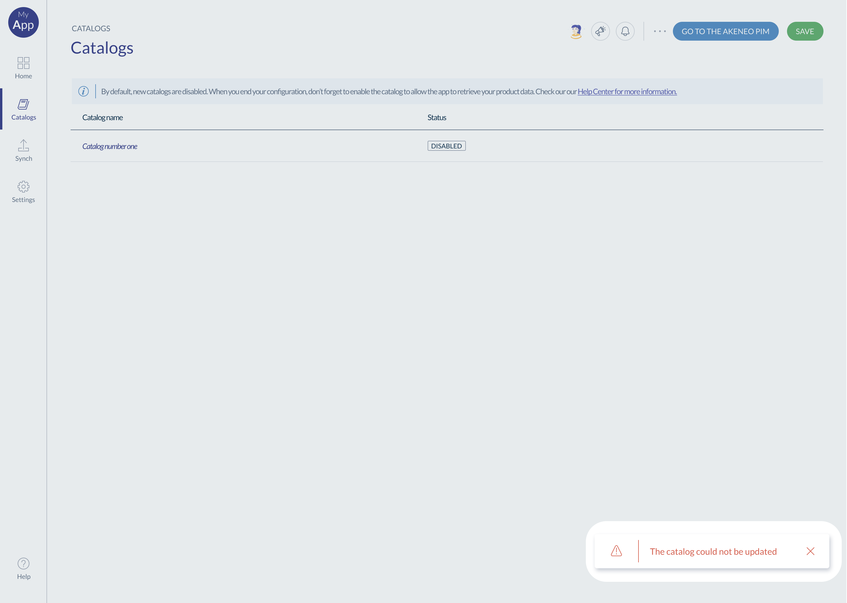
#Warning & error
Always display clearly warnings and errors to the user.
- Good error messages are crucial, even if the most effective designs should prevent any issue from happening. This can be achieved by either removing conditions likely to cause errors or by anticipating these conditions and offering users a confirmation option before they proceed.
- Make sure the language/wording is adapted to the user profile. As an example, avoid using technical language for a business user.
For errors, explain the situation, and provide a solution/options:
- A link to the page where the user can resolve the error
- When there is no link, explain the different options to resolve the error
A confusing error or no solution can be very frustrating for the user and contributes to a poor user experience.
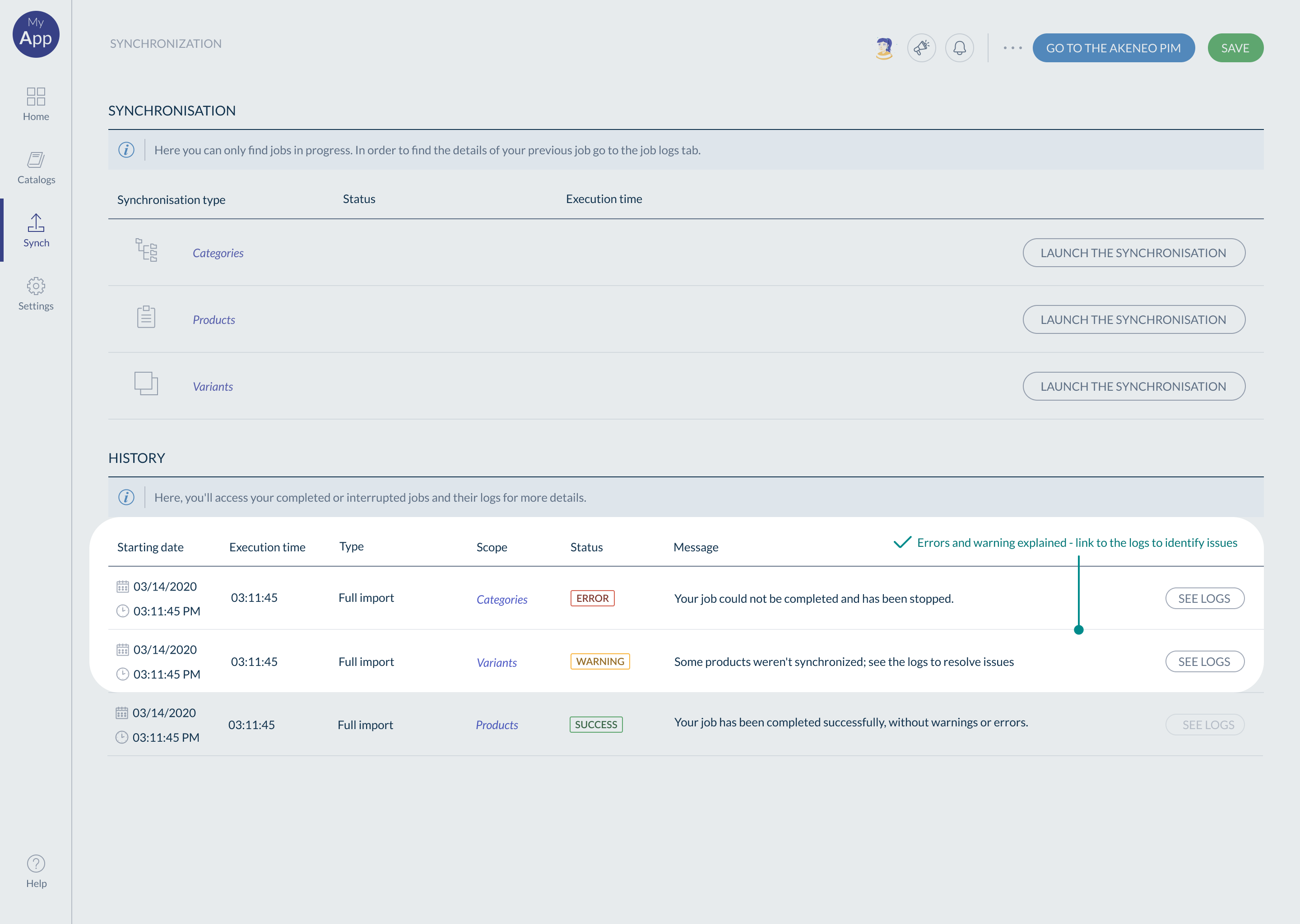
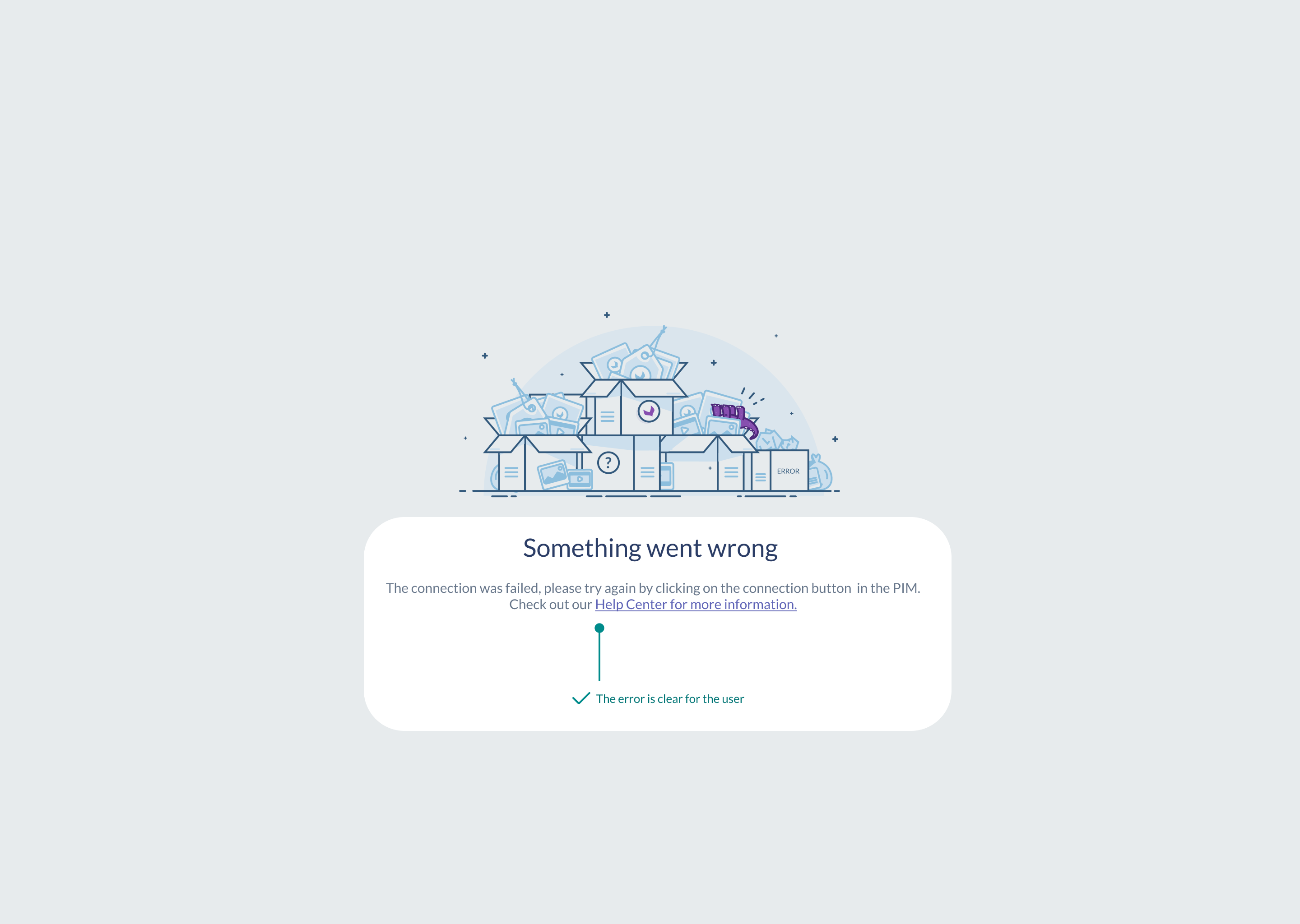
🟢 Good examples of errors & warnings 👇
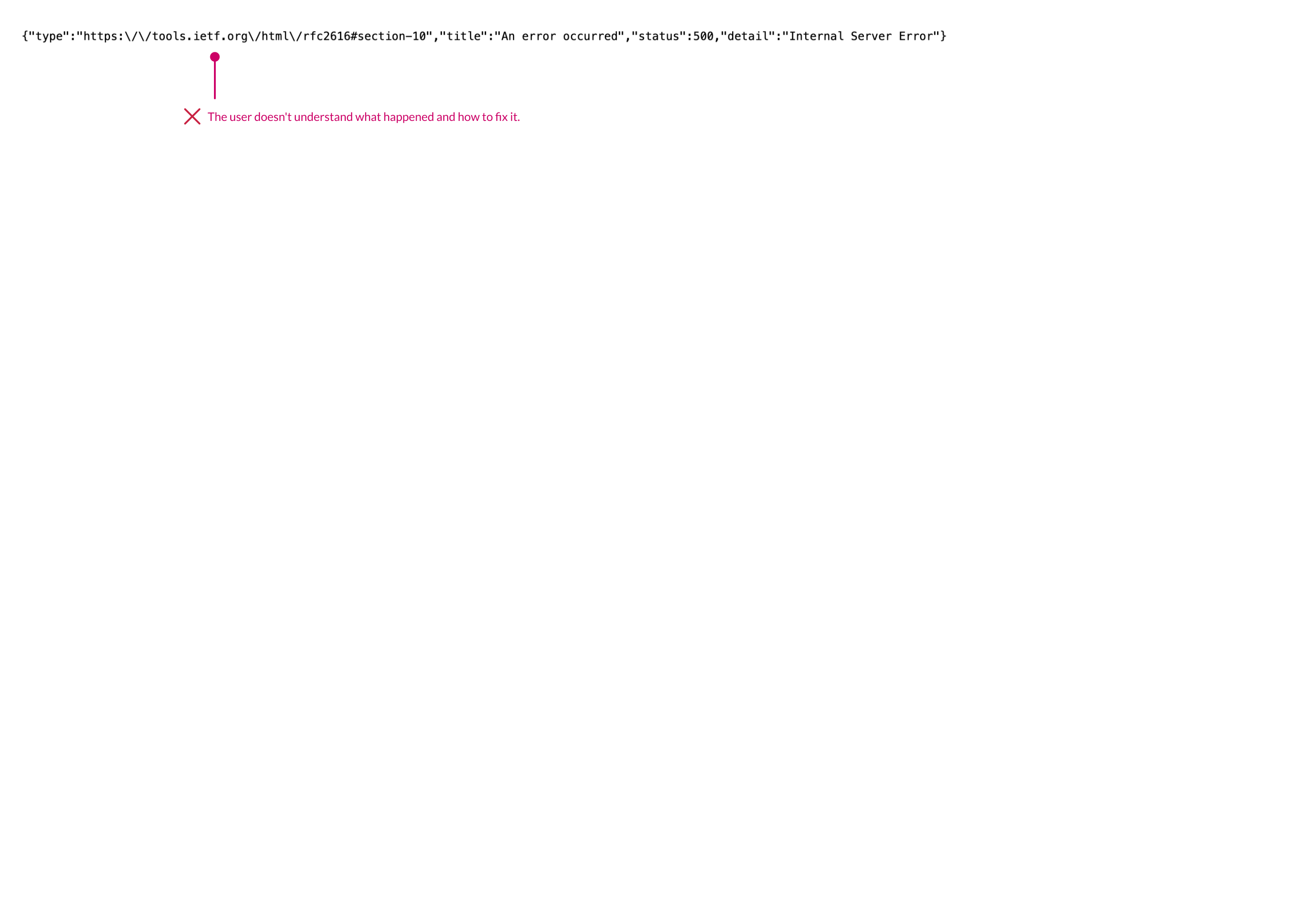
🔴 Bad example of error 👇
#Call to action
Call to actions are a critical part of the user journey
A call to action (CTA) is a prompt on a app, that tells the user to take some specified action. CTAs are often buttons or links, and play an important role in user engagement, and the overall user experience. In this section, we will focus specifically on buttons.
#The affordance
Affordances are the properties of an object that suggest or indicate how it can potentially be used. In short, buttons need to look like buttons, to ensure users understand that they are clickable elements.
#The number of buttons
Limit the number of buttons on the same page. Too many buttons sometimes mean there are too many features on the same page. This can confuse users and make them feel the solution is too complex to use.
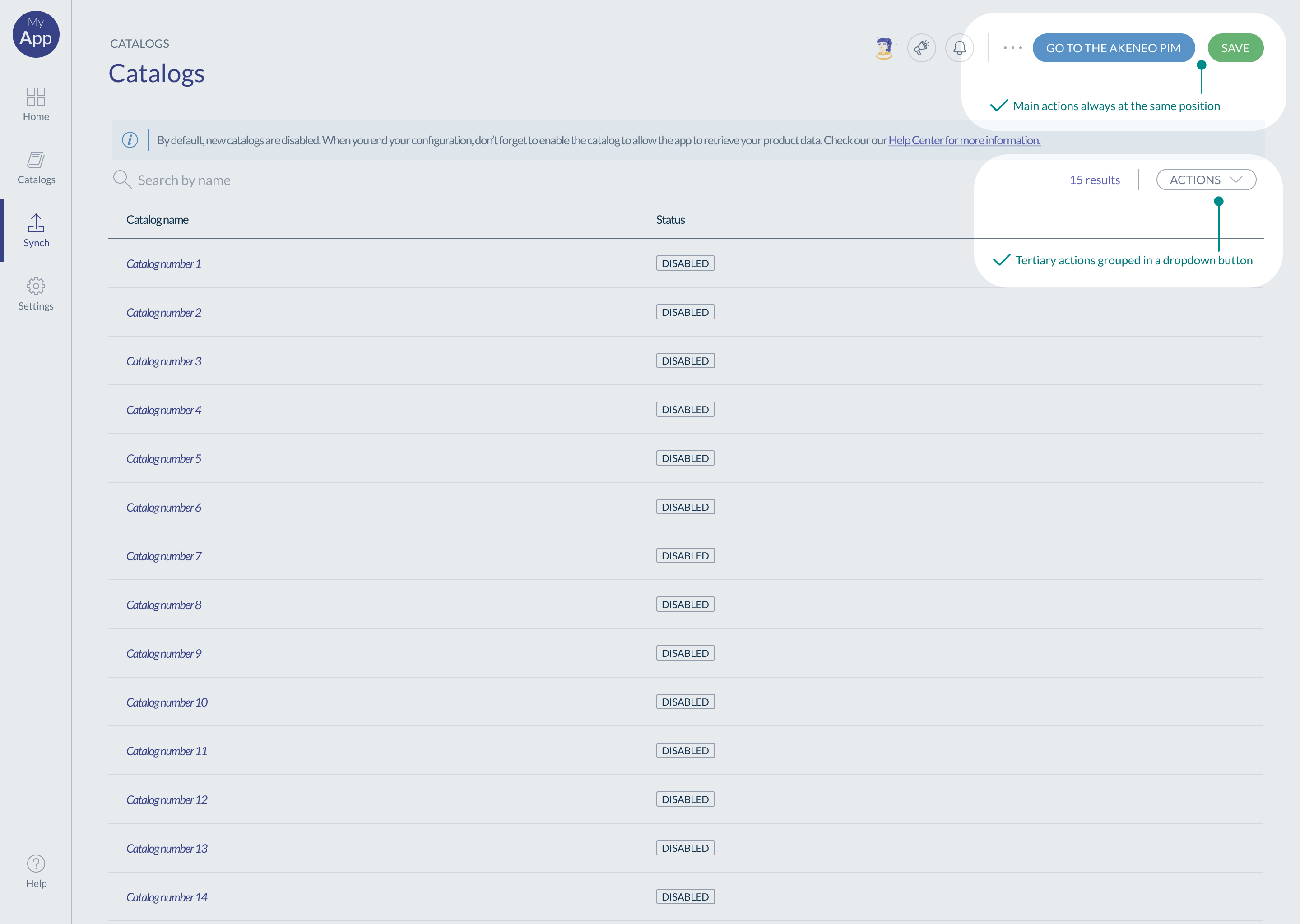
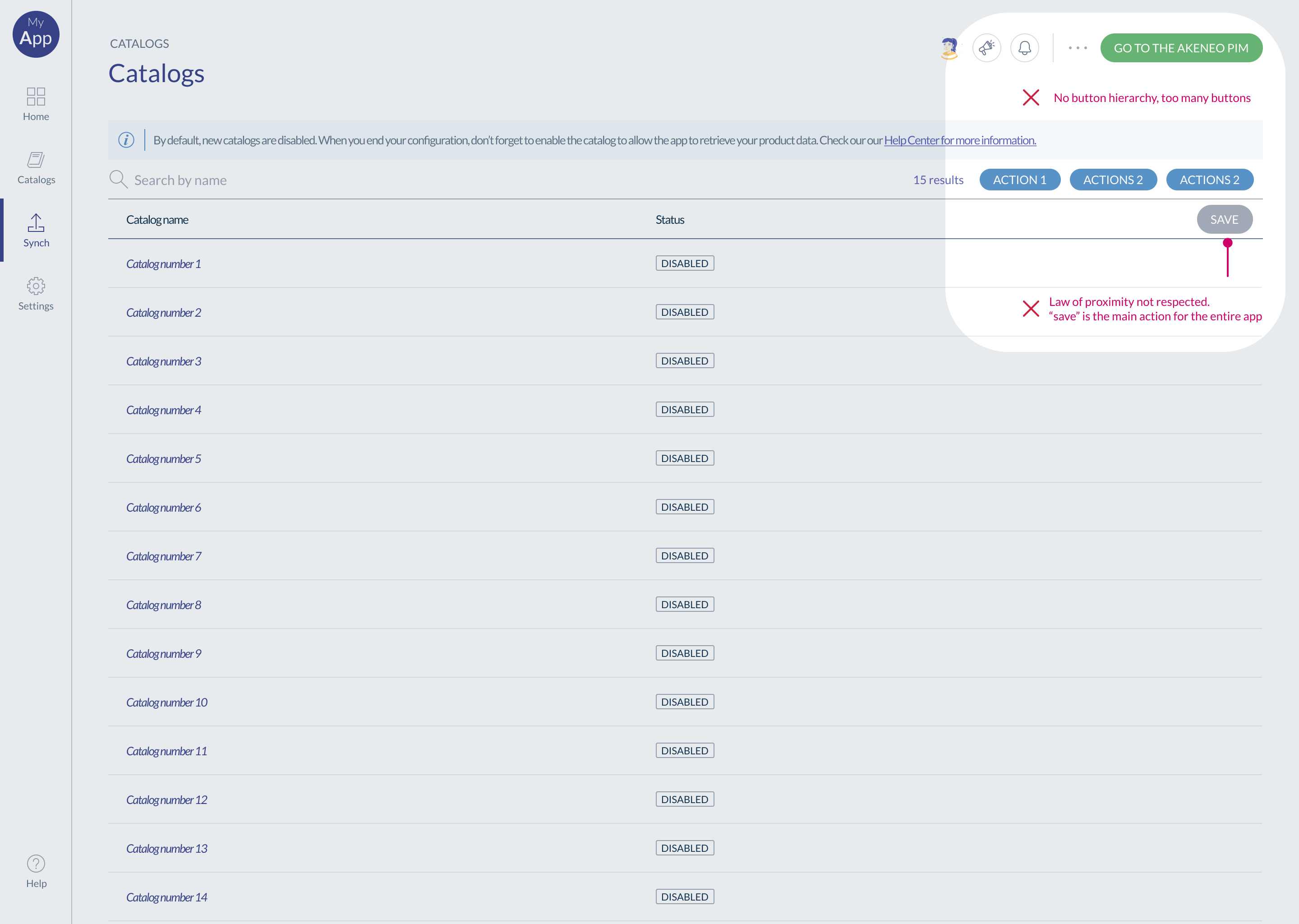
We recommend a maximum of 3 buttons above the waterline. If you need more than three buttons, some of these actions are probably less important to the user, and you can group them under a dropdown button.
Consider using links instead of tertiary buttons, to simplify the screen and create a natural visual hierarchy.
#Button positions
Position your buttons logically and consistently in the same place throughout all your pages. Doing so helps with making the navigation more intuitive and contributes to improve user adoption.
When positioning buttons, think about the following guidelines:
- Buttons hierarchy: the primary button has to be more visible than the others.
- The proximity law: a button launches an action, which has to be close to the impacted screen section.
For example, a save button for all the pages should be at the top of the page. A button preview of an image should be close to the image.
🟢 Good example - Number of buttons & position 👇
🔴 Bad example - Number of buttons & position 👇
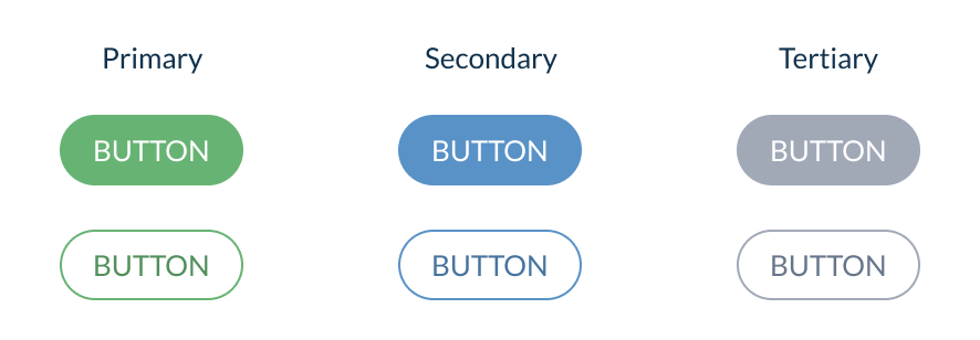
#Buttons hierarchy
Hierarchize your buttons according to their importance to avoid overwhelming users with too many CTAs.
There are three levels of button hierarchy:
- Primary: this is the main action of your page, a significant action for the user to complete their objective in this context. Choose a design to help the user quickly identify this action.
- Secondary: It's an important button to complete the action but it less important than the primary action.
- Tertiary: For any other action, less important than the 2 first ones. This could be a link for example.
To show this hierarchy you can use Design elements 👇
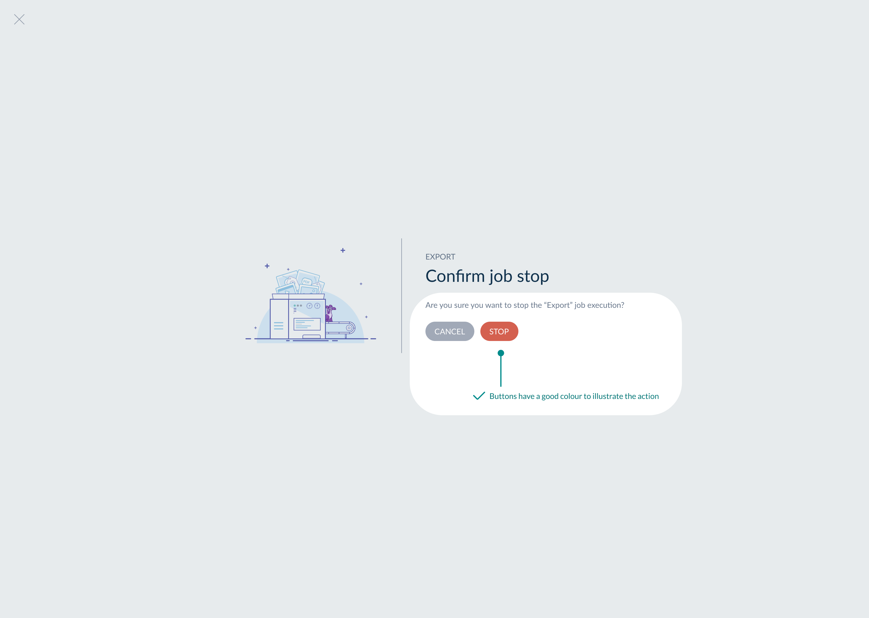
#The button colour
Some colors have meaning; it's very important to respect that, especially red and green.
- Red buttons: red is a special color on buttons because it's used to signify a warning state. As an example, buttons that have destructive actions for deleting data are red to warn users of potential danger.
- Green buttons: green is usually used to validate, confirm or save something.
🟢 Good example - button colour 👇
🔴 Bad example - button colour 👇

#Disabled button
When you are using a disabled button, it must be obvious to the user.
Select the right color, add a tooltip on the hover that explains why the button is disabled.
The most common way of illustrating a disabled button is to reduce its opacity but make sure you maintain sufficient contrast to guarantee accessibility.
#Wording on the button
We recommend being consistent with buttons wording across the app. For example, if you use an action verb on your buttons, do it for all your buttons. This reduces your users' cognitive overload.
#Feedback
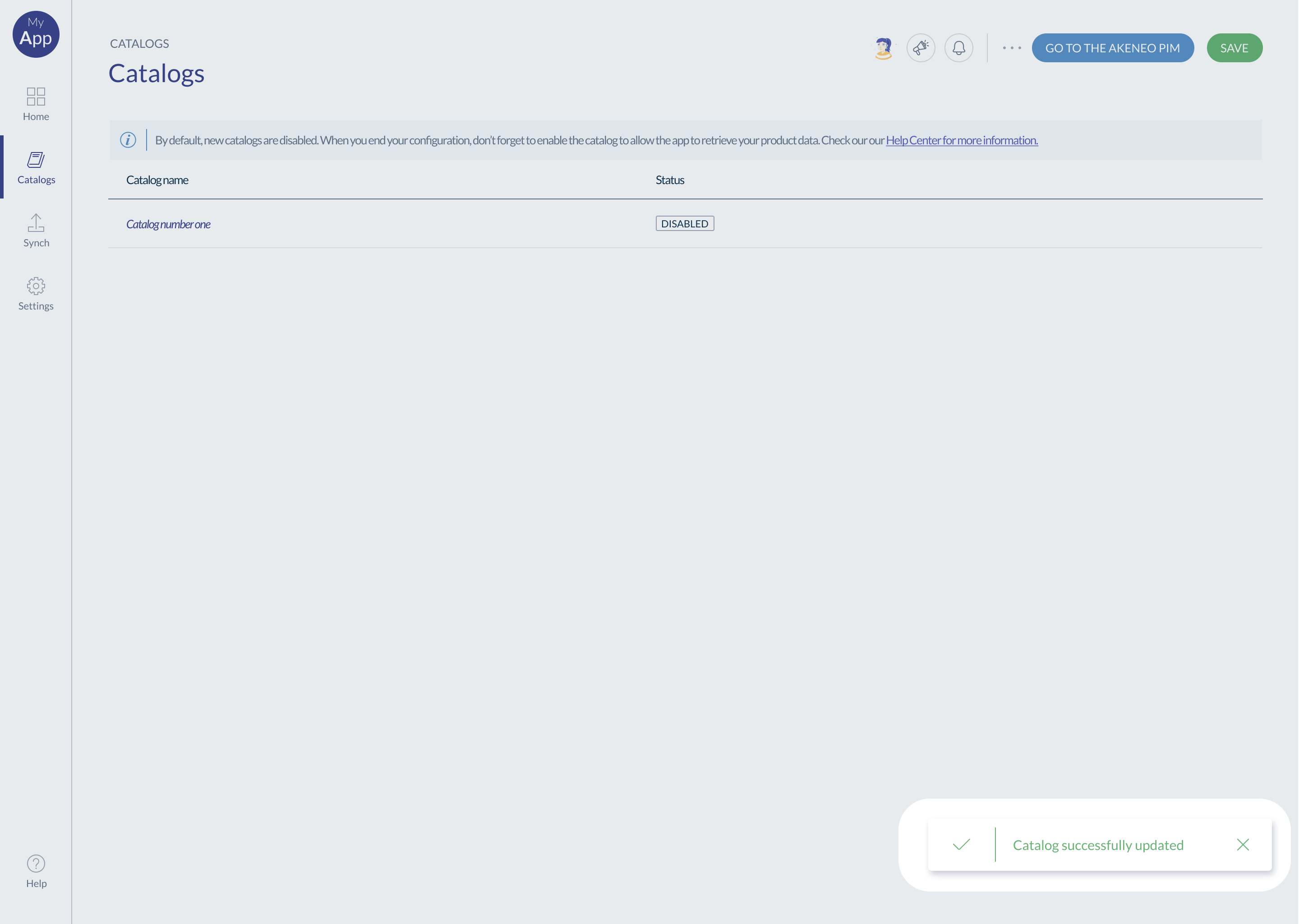
When there's an action, always keep users informed about what is going on, through appropriate feedback, and ideally instantly.
- eg. when deleting an item, the item disappears straight away
- eg. when saving a page, show a confirmation the page has been saved (using a 'tick' or a message)
Some actions have less obvious feedback than others.
That's why for each action, ask yourself: are we communicating clearly to the user the feedback of the system?
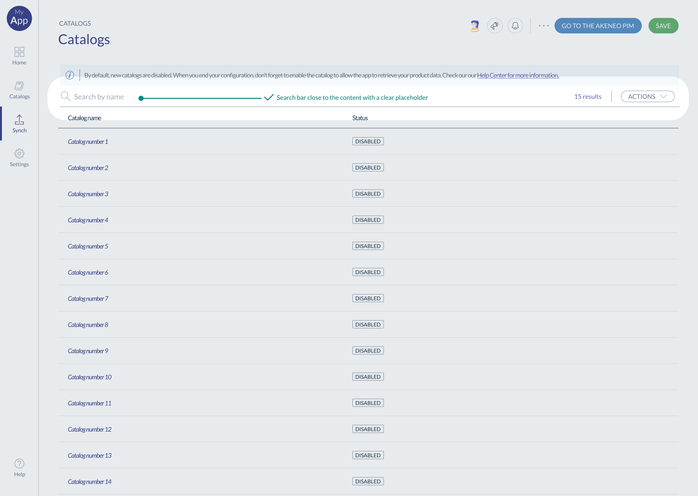
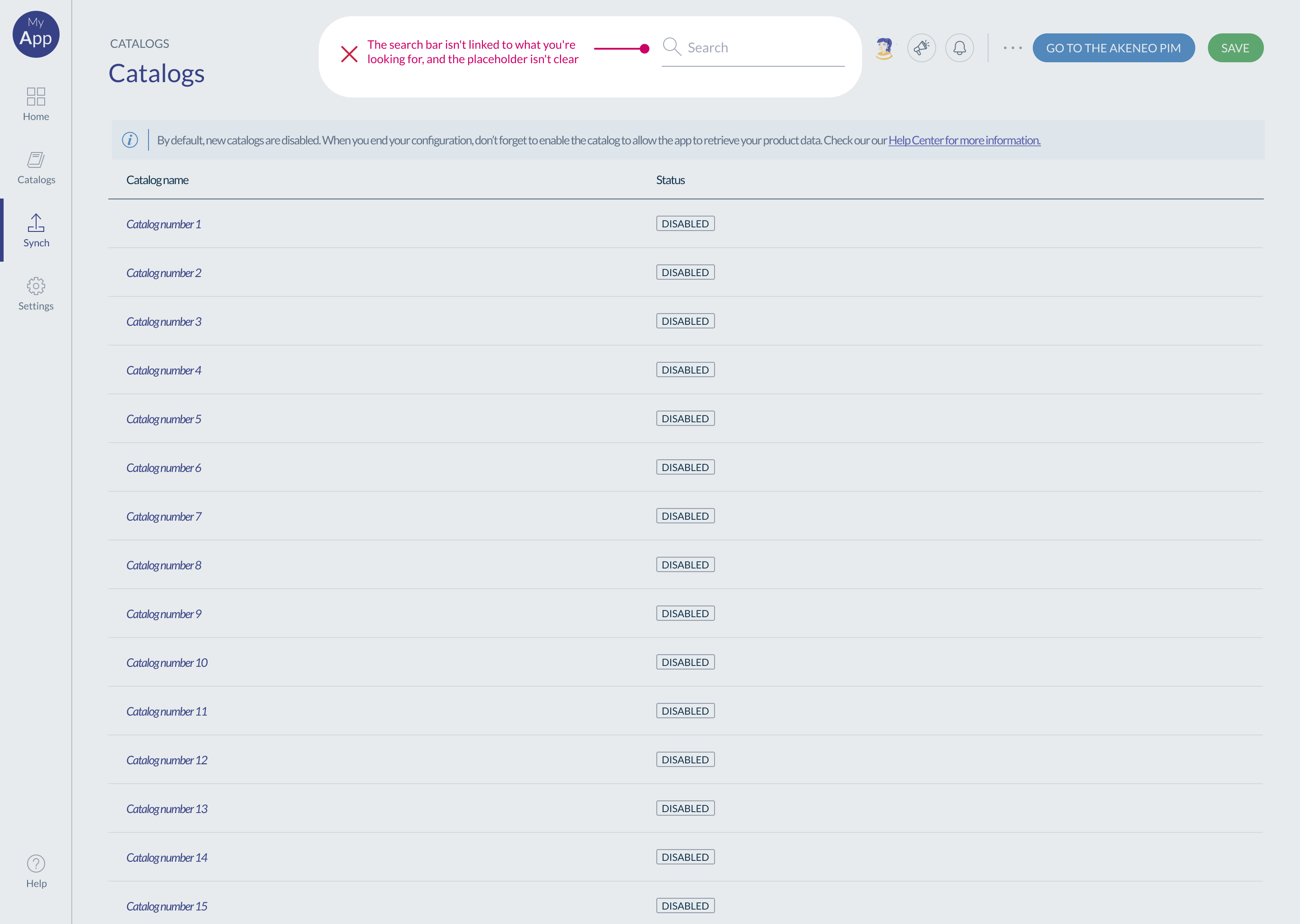
#Search
- A search bar has to be attached to the items it’s used on, a table, for example.
- If the search bar only works on some elements in the component, you can explain users what is searchable and what isn’t.
🟢 Good example 👇
🔴 Bad example 👇
#Accessibility
Thinking about accessibility when you are defining the UI is fundamental. We recommend to test your component with accessibility tools. On the W3C website, you can find a list of tools to test your app accessibility: https://www.w3.org/WAI/test-evaluate/tools/list/
If you use Figma to build your mockups, a plugin is available to test the contrast: A11y.
Some guidelines to keep in mind (non exhaustive):
#Text
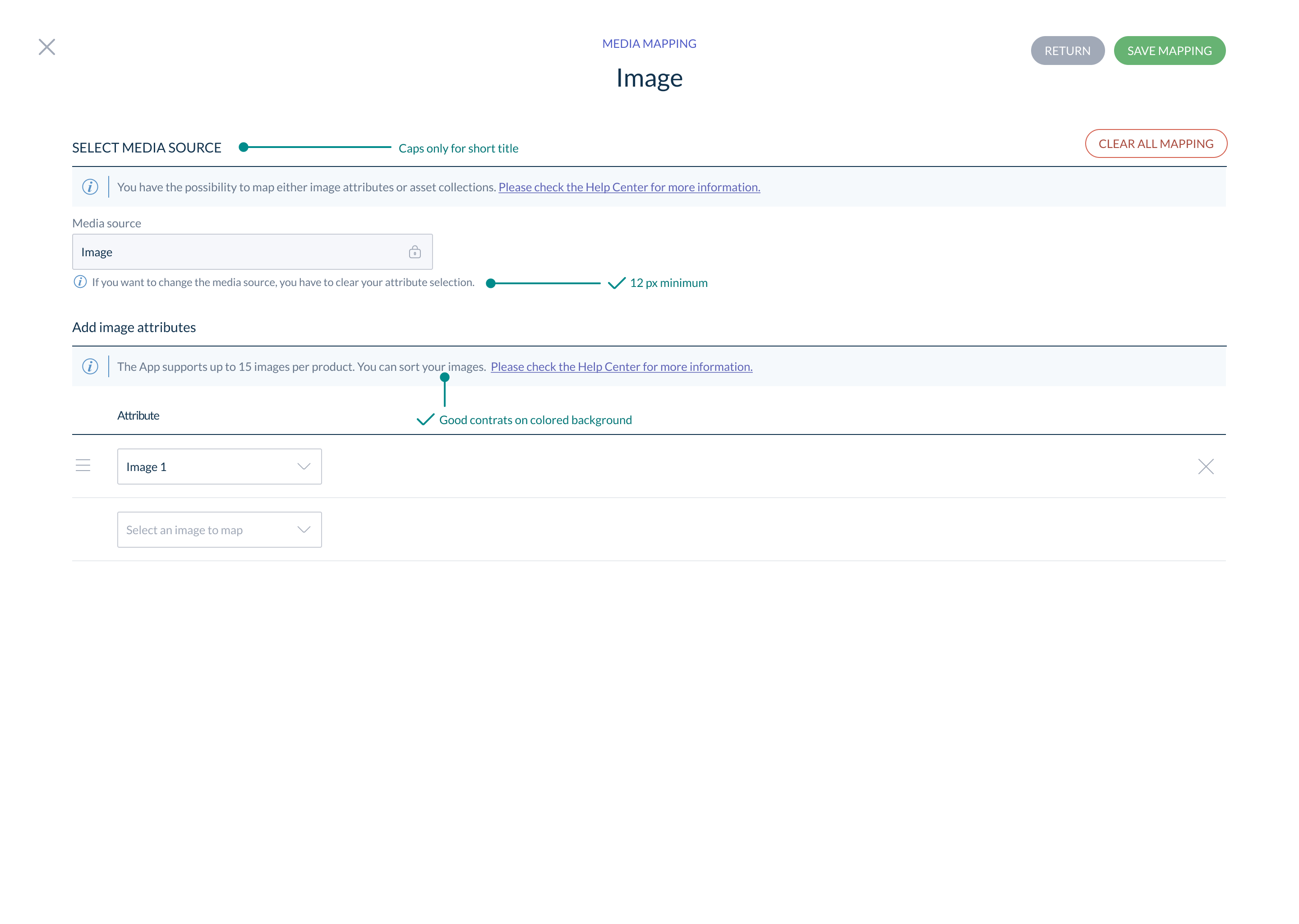
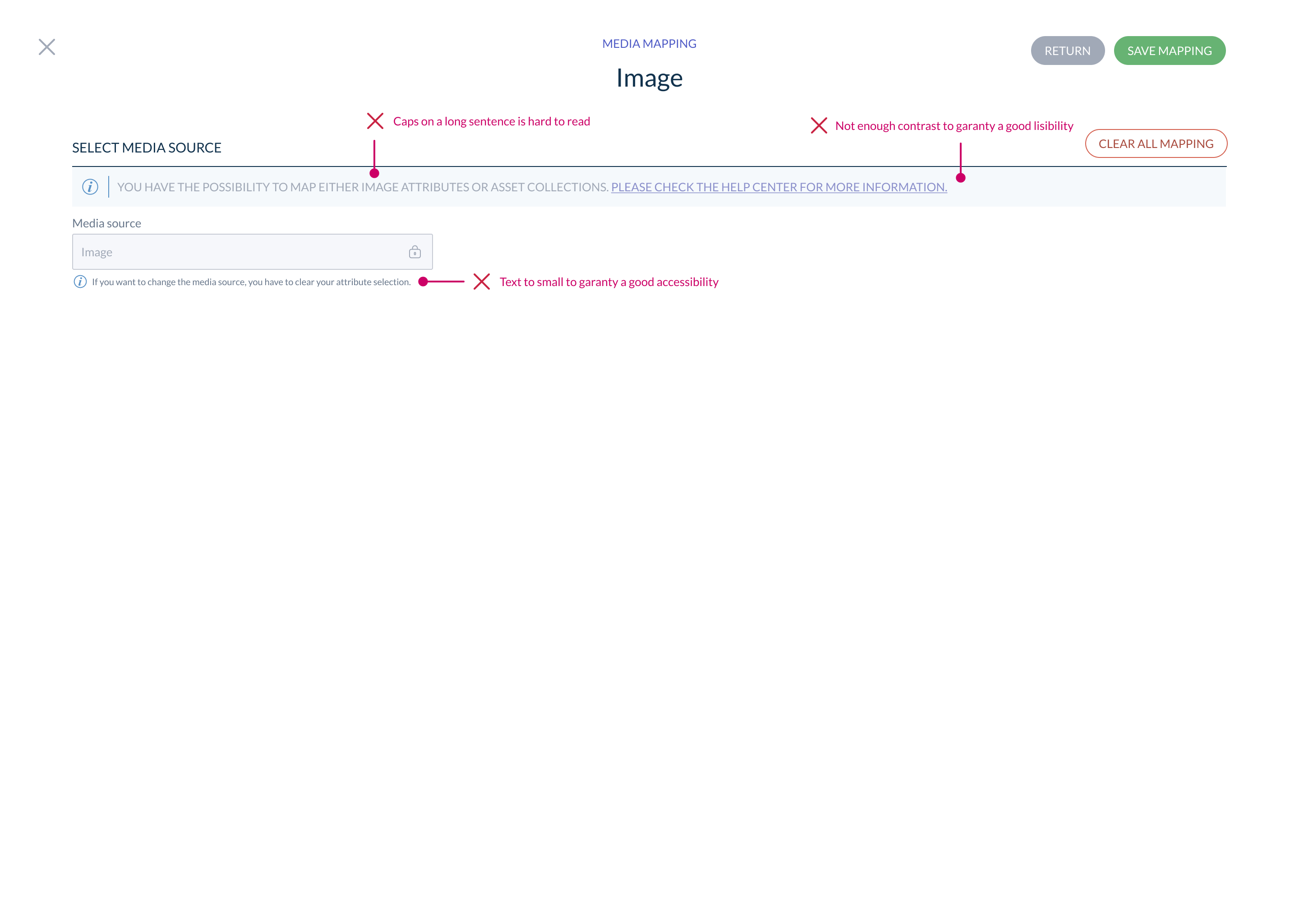
- No text should be smaller than 9pt (12 px)
- Use the Caps carefully, just for short text like short titles or labels.
- Select readable font, for example, for digital, sans-serif fonts are clearer and easier on the eyes.
#Colors
- If you want to use colors for text, make sure that the contrast is strong enough to remain accessible
🟢 Good example of accessibility & contrast 👇
🔴 Bad example of accessibility & contrast 👇
#Requirements checklist
Here's a list of recommendations based on the documentation you've just read. We strongly recommend that you follow all the recommendations to guarantee a good user experience, a good brand image and limit support requests.
Recommendations tagged MANDATORY are mandatory for your app to be published on the app store.
#Navigation
☐ Every page in my application has a title MANDATORY
☐ Each page gives access to information/features that are expected to be found on that page MANDATORY
☐ The navigation is organised in a coherent way to support effectively the main user flows MANDATORY
☐ My application has a breadcrumb trail, enabling my users to find their way around and navigate. MANDATORY
☐ Each page is related to a user need.
☐ My users have access to the necessary actions to navigate at all times (eg. Next, Back, Close, Cancel).
☐ My users have access to a search function whenever necessary (eg. when the number of items is too long to fit on a page or when it takes too long to browse)
#Action buttons
☐ The buttons color is coherent with the associated action. MANDATORY
☐ The actions behind the buttons are clear (thanks to a clear label and a 'helper' if needed) MANDATORY
☐ For each critical action (eg. data deletion): the user is warned and a confirmation is requested. MANDATORY
☐ My users receive a clear system feedback for their key actions throughout the app (eg. confirmation of data being saved) MANDATORY
☐ For pages with multiple buttons, the button hierarchy is visually clear (primary, secondary, tertiary).
☐ There is a clear explanation for each disable button in my application (eg. thanks to a 'helper').
#Accessibility
☐ My application has no font size below 10 pixels. MANDATORY
☐ My application's contrasts are RGAA compliant.
#Onboarding & Support
☐ The first action for first time users is clearly displayed. MANDATORY
☐ All error messages in my application are adapted to my users profile, and provide options of resolution. MANDATORY
☐ My users can easily access the app support documentation at all times. MANDATORY
☐ My app has a clear onboarding flow available (for complex scenarios/big learning curve)
☐ Each icon without a label has a tooltip explaining its meaning (few exceptions for conventional icons which don't need a label, such as a 'house' icon for Homepage)
☐ When relevant, my application field inputs have information to guide the user on what is expected (in the field itself or next to it)
☐ Any feature name, concept or wording specific to my application's field of expertise that may not be clear to my user is explained (eg. via a helper)
#Page structure & content hierarchy
☐ All the pages of my application follow a consistent/coherent structure, allowing my users to navigate the app easily. MANDATORY
☐ I made sure that the information is hierarchically organized to make sense to my users — headings, sub-headings, grouping similar information or features. MANDATORY
☐ I've made sure that the action buttons are displayed in a consistent location across the app pages - and that pages are structured in a logical way. Features are organized to match my users journey.
☐ In my application, no feature is hidden below the waterline (for a 1280px x 800px resolution)